
Cardew, Finch, Winchcombe Pottery and Slipware
Welcome to my humble collection of traditional British slipware. If you are interested in this subject then check out the Micheal Cardew book listed below and the other links.The Last Sane Man at 380 pages is not a light read but it will give you a thorougher understanding of the origins of British C20th slipware and insight into a fascinating life story.
The slideshow works best on PC. It scrolls through all the below images full-sized.
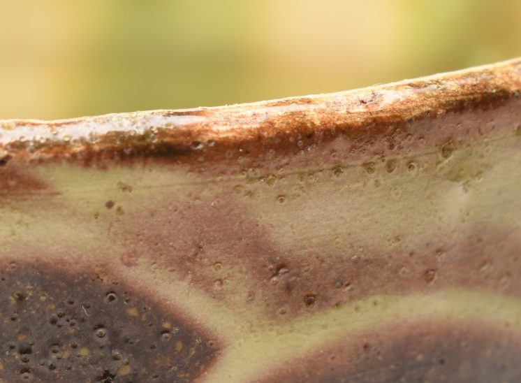
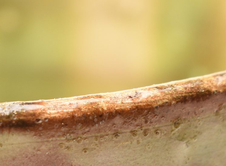
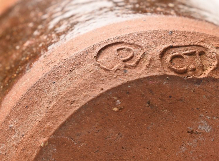
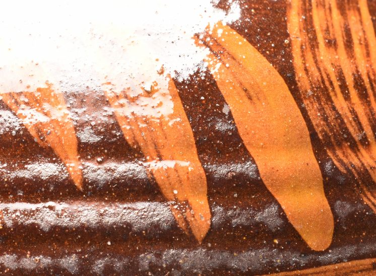
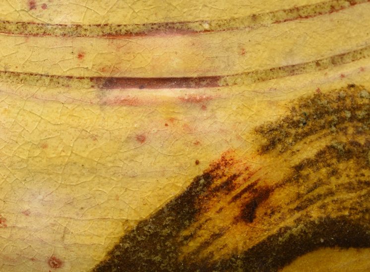
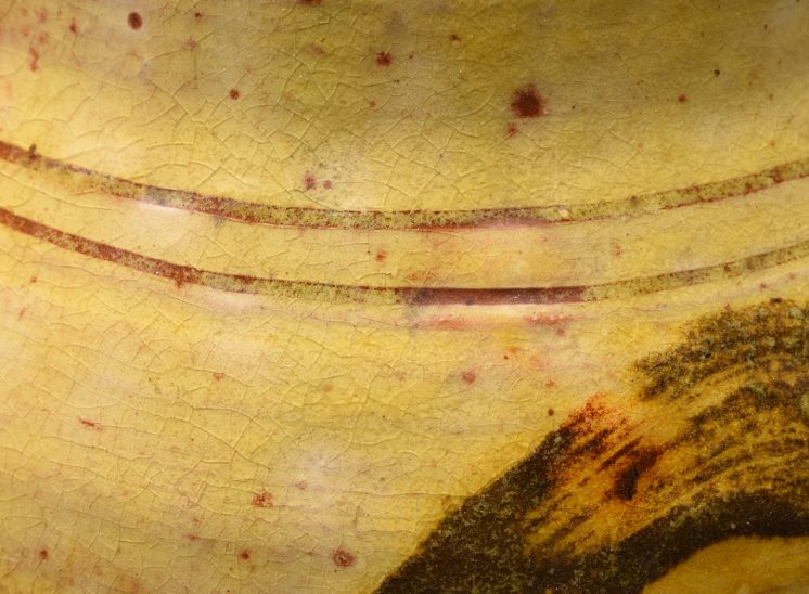
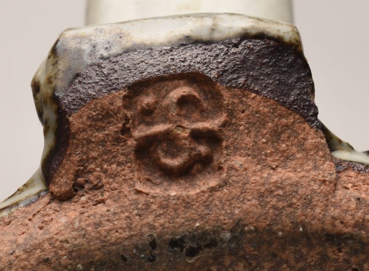
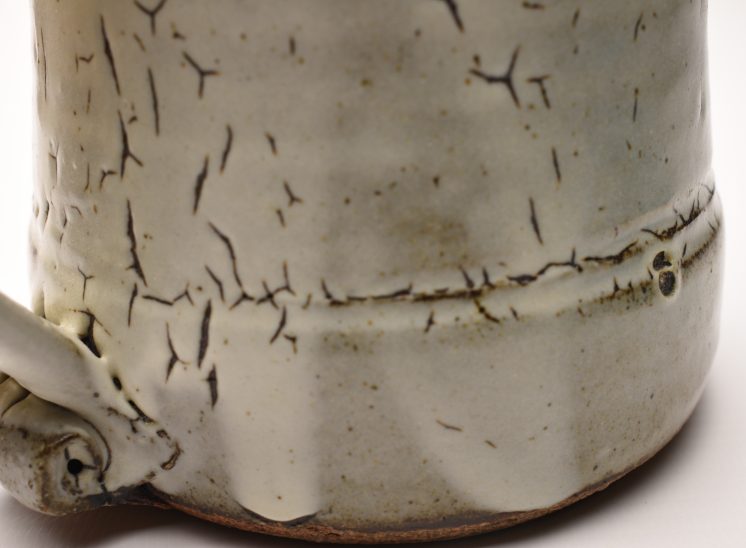
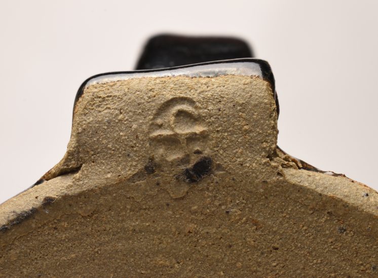
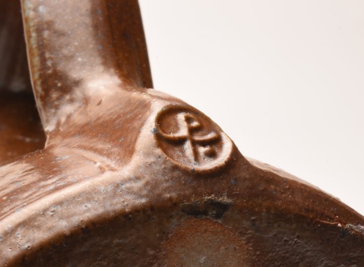
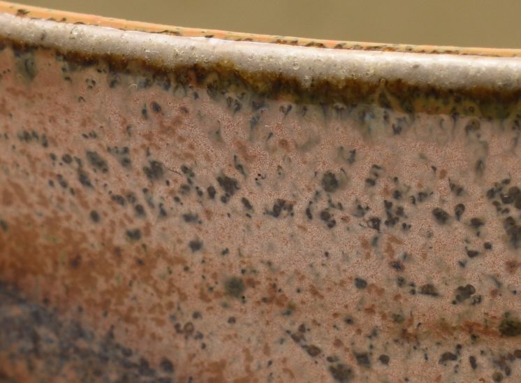
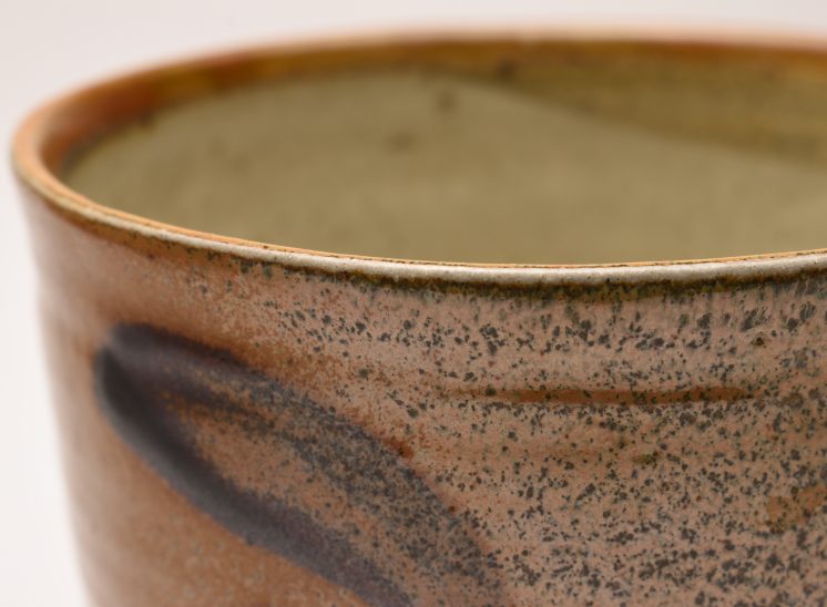
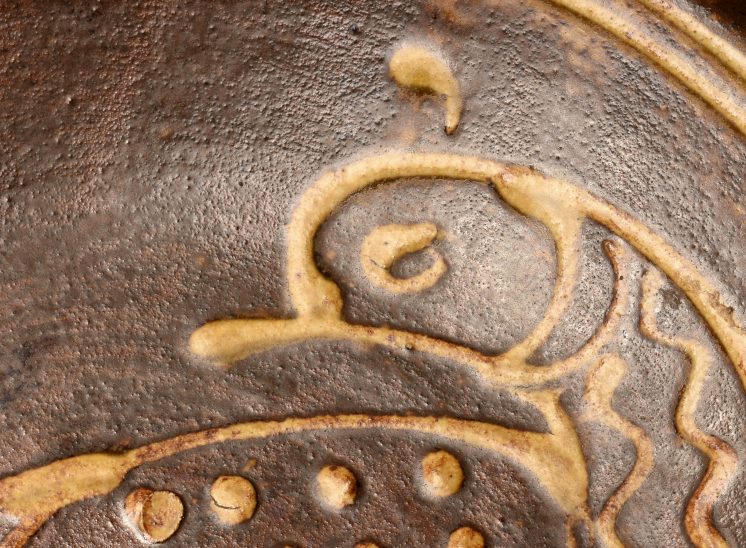
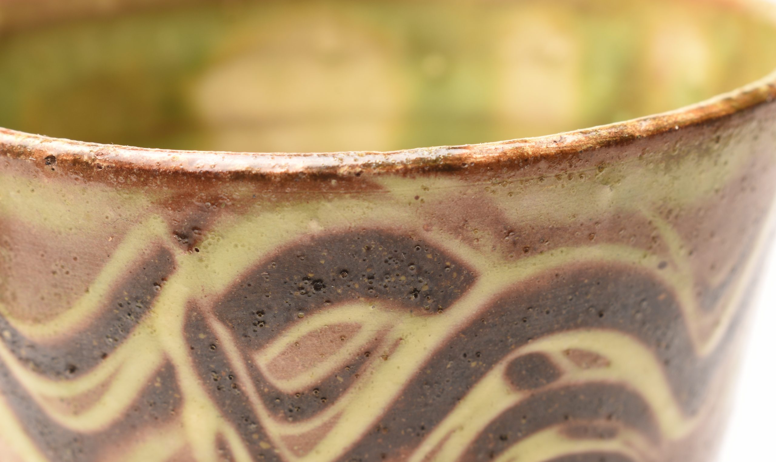
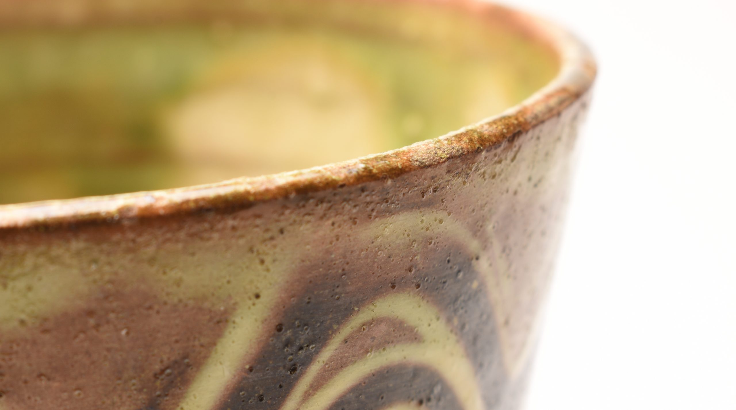
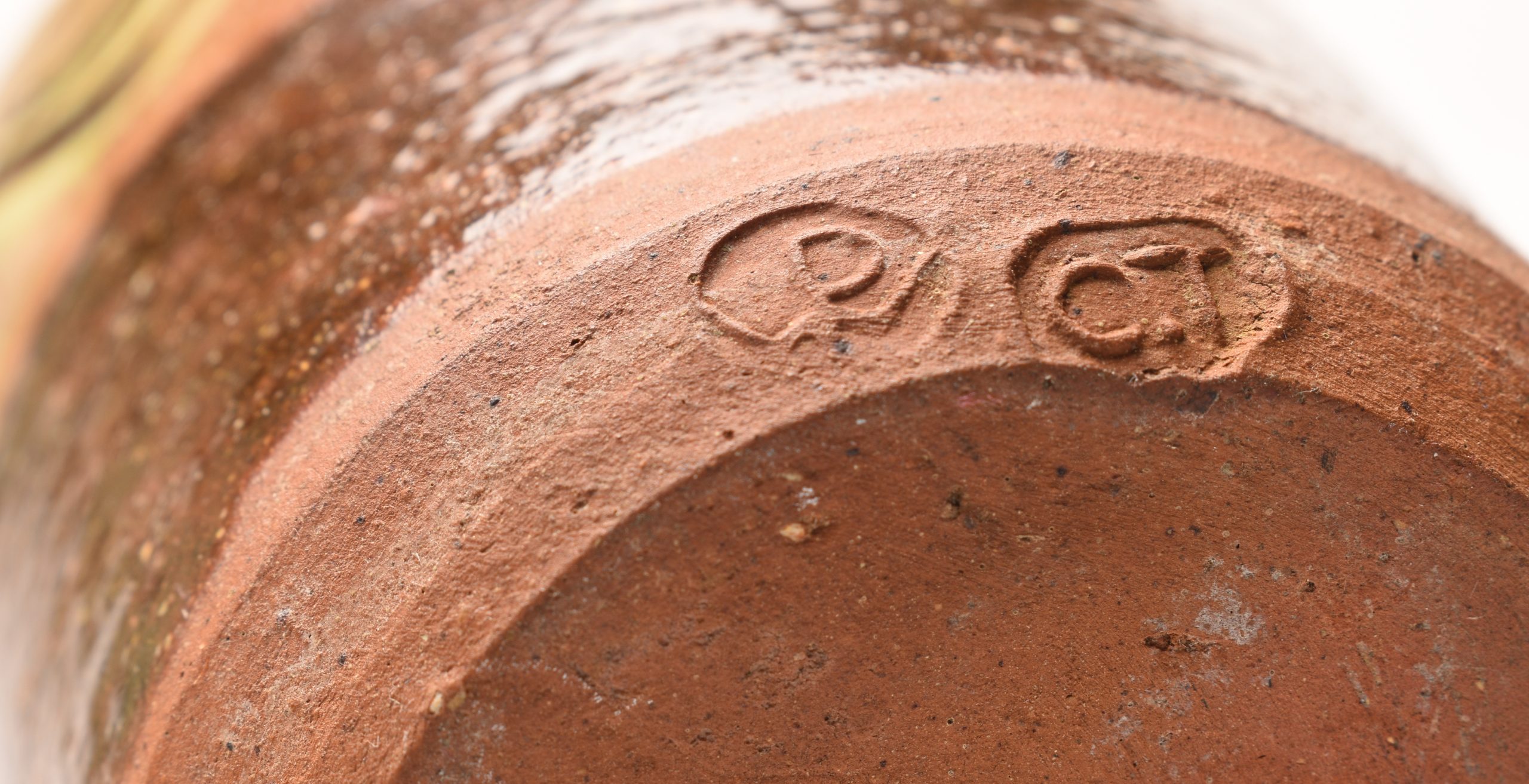
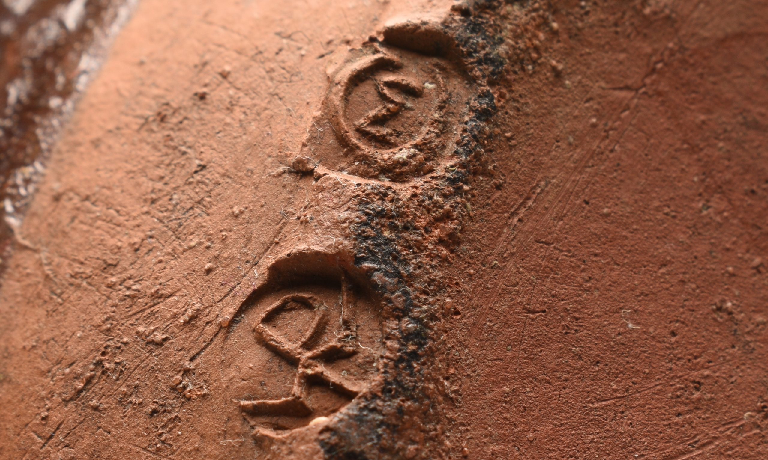
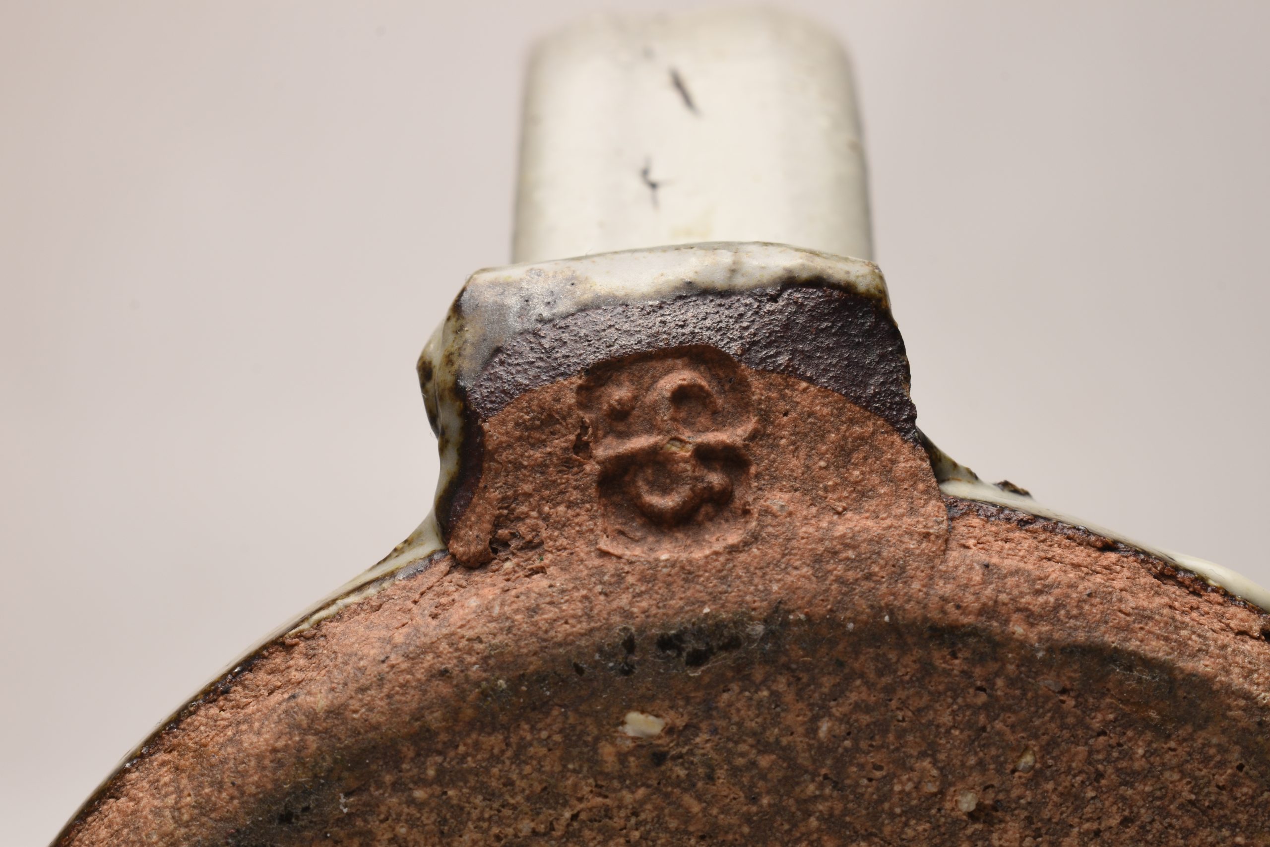
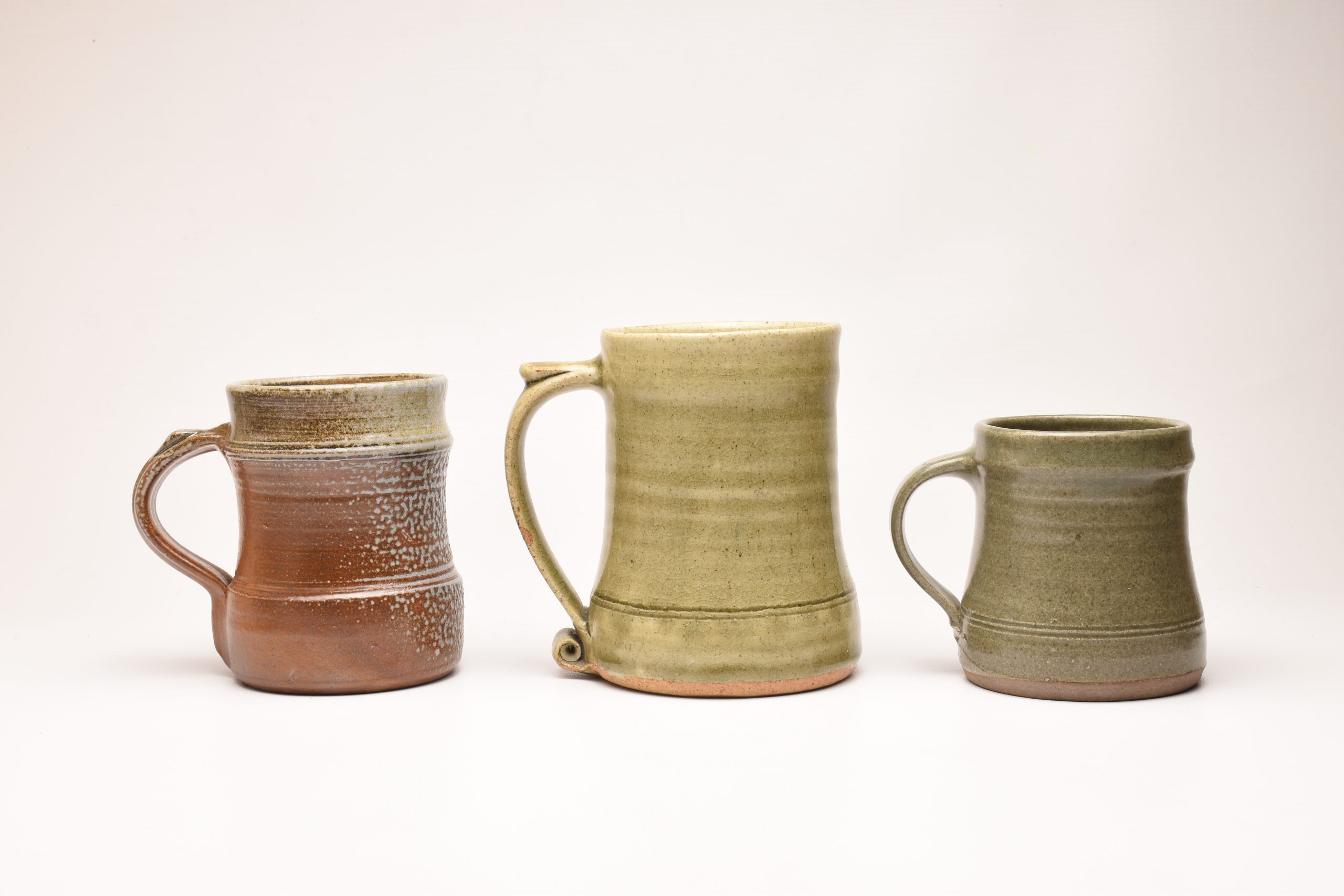
Charles Tustin Winchcombe Pottery Beaker
A humble Charles Tustin beaker, a very common item. I still find the textures and finger wipe in slip wonderfully fluid and spontaneous. Charlie worked for many years at Winchcombe and there is a significant amount of his work out there so prices are very reasonably. Charlie left in 1954 when Ray Finch reduced the workforce at Winchcombe.
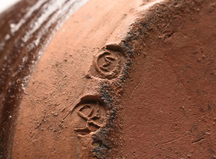
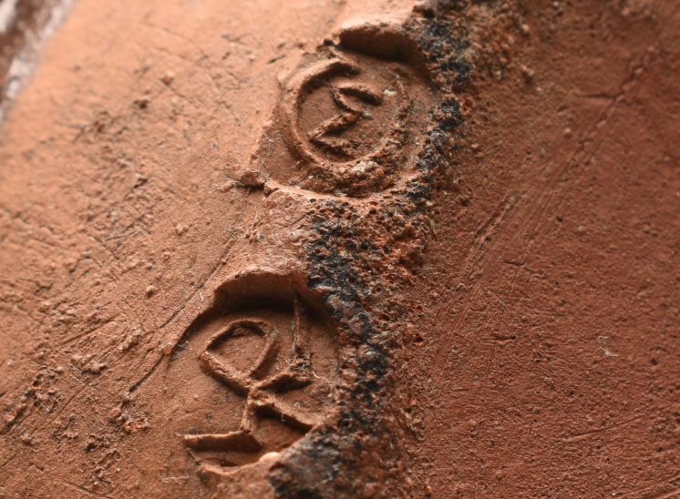
Charlie Tustin seal is the CT mark, his brothers mark is ST for Sidney Tustin (1913 - 2005). WP is the Winchcome Pottery mark. This is probably a cider beaker.
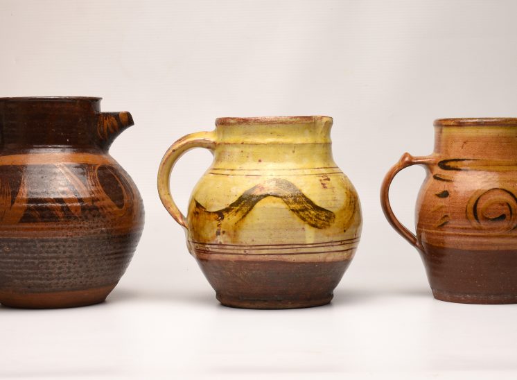
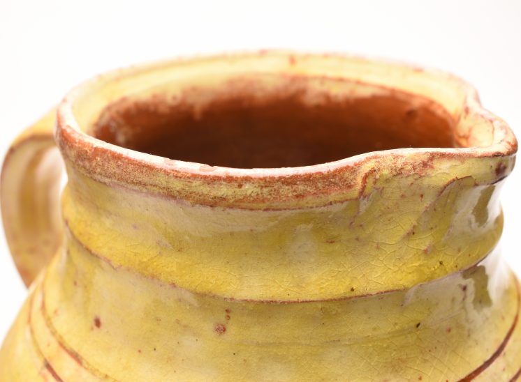
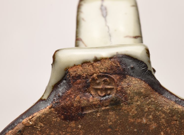
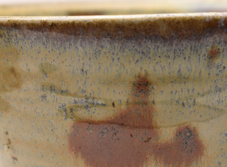
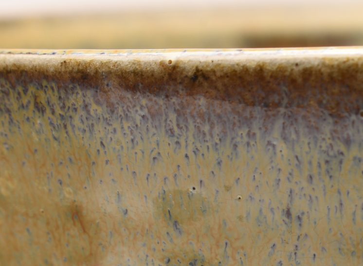
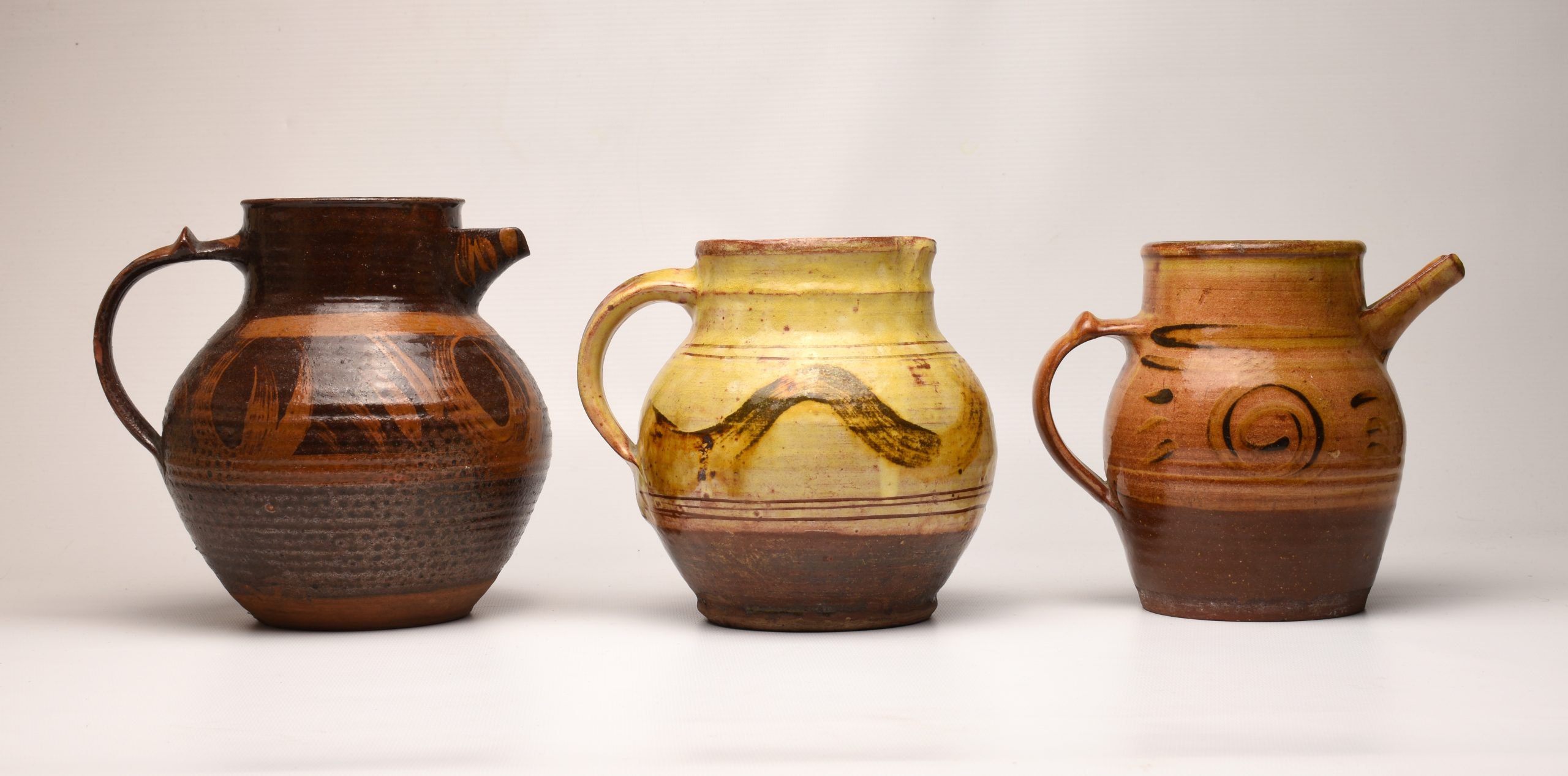
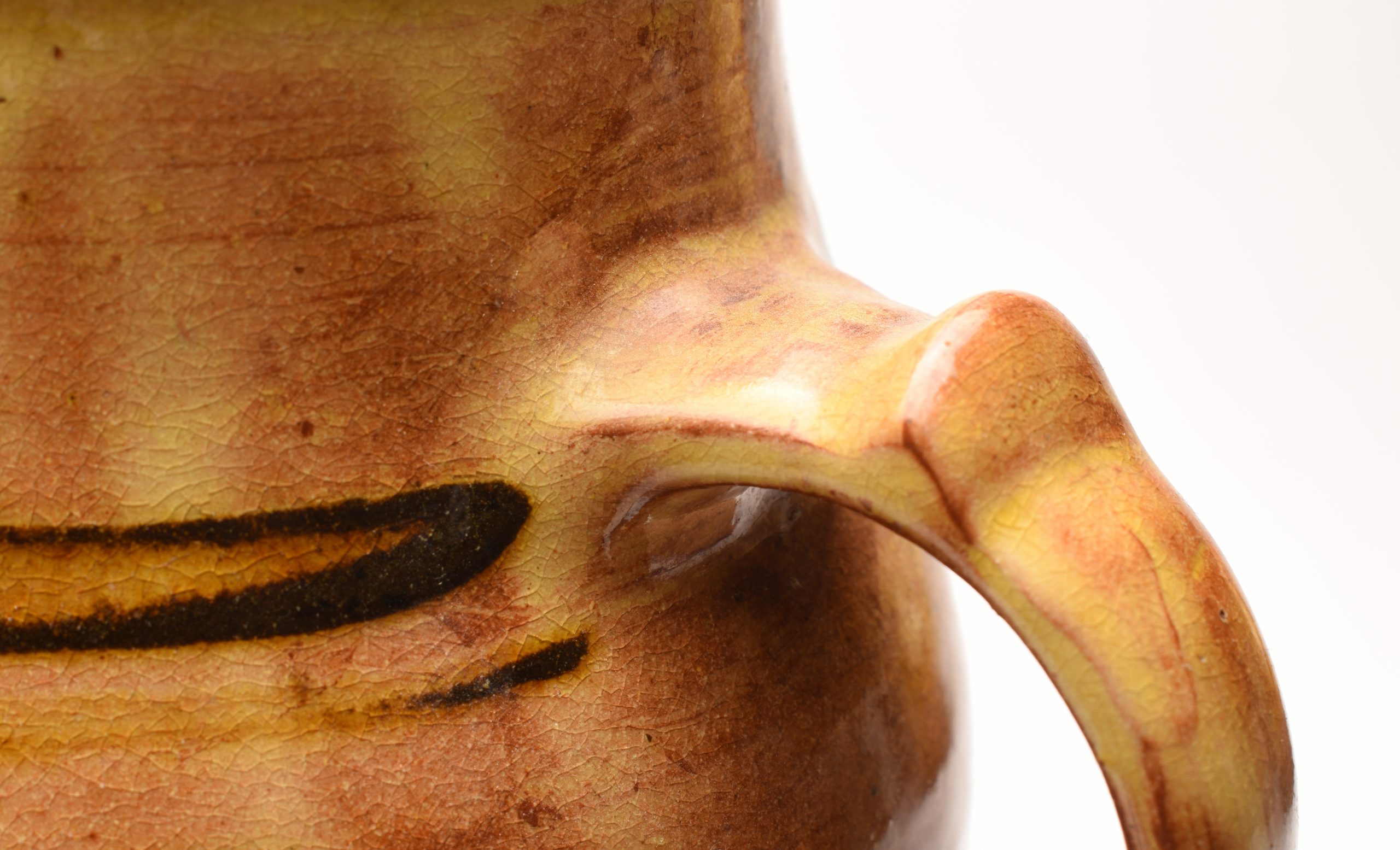
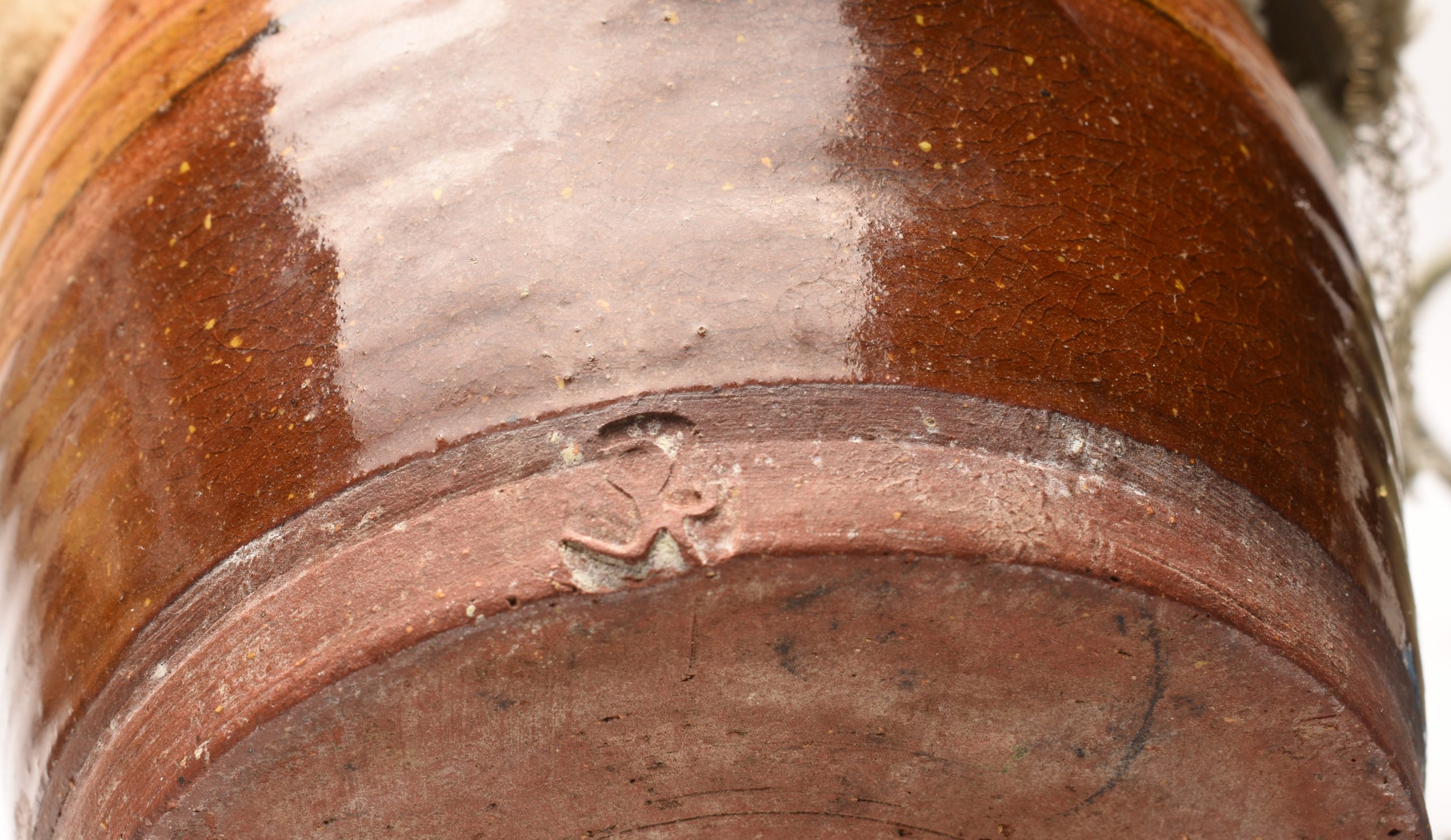
Micheal Cardew Coffee Pot
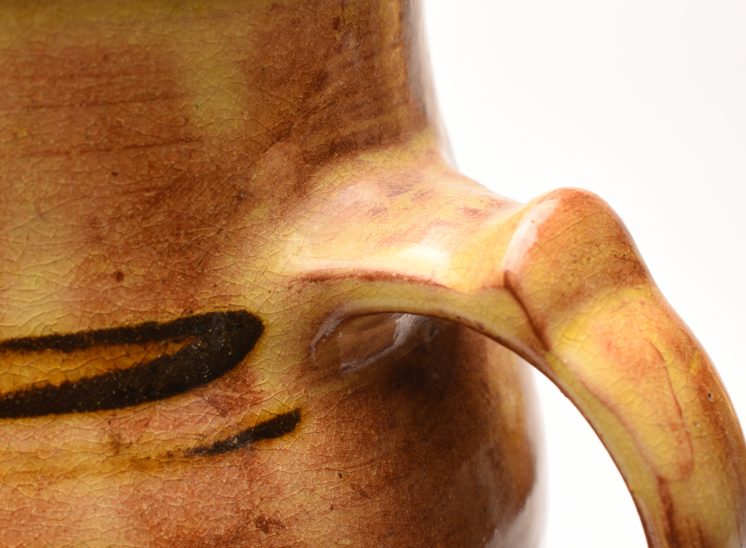
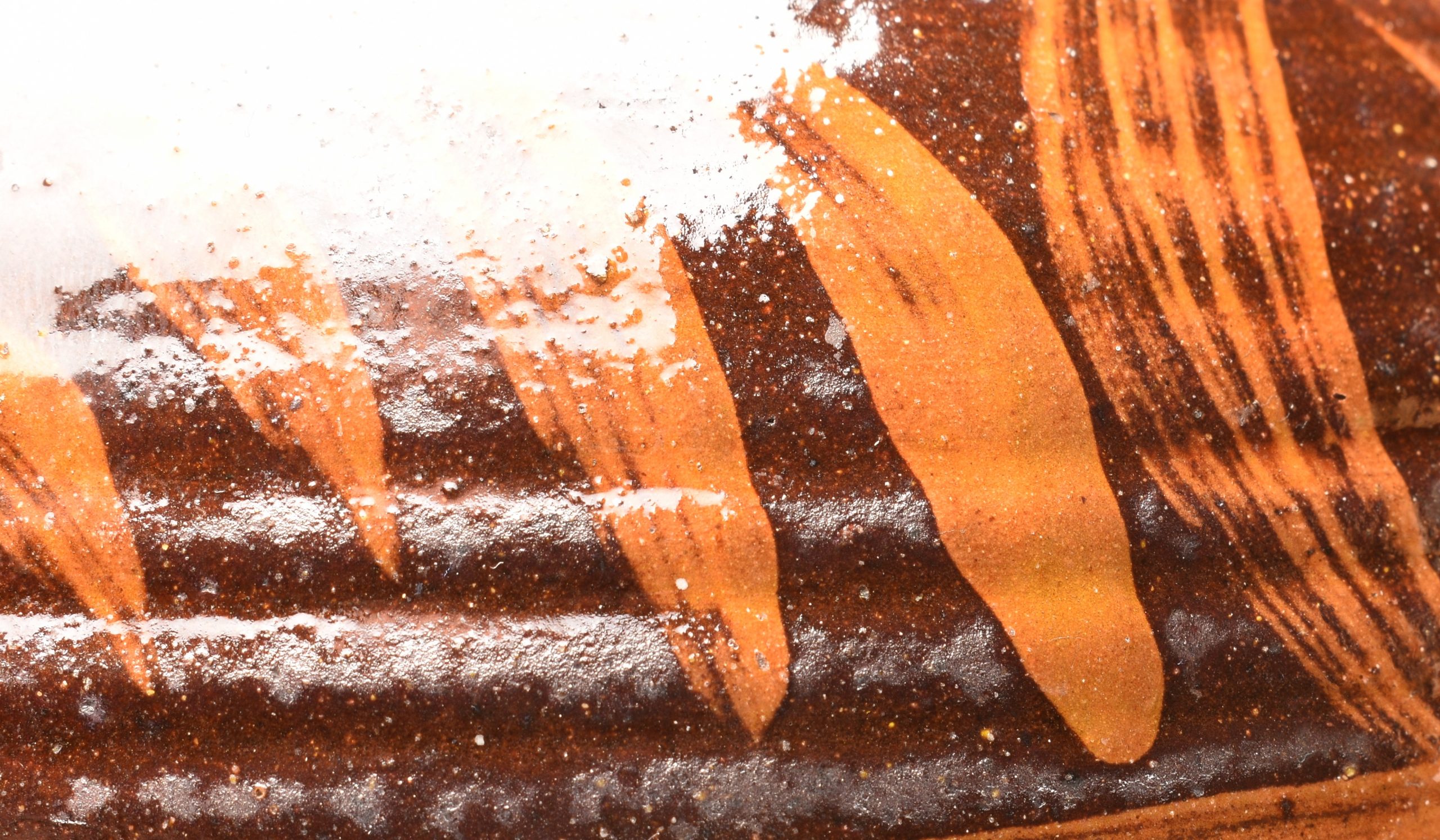
Michael Cardew Slipware Jug
Winchcombe Coffee Pot
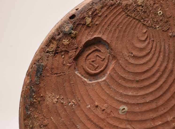
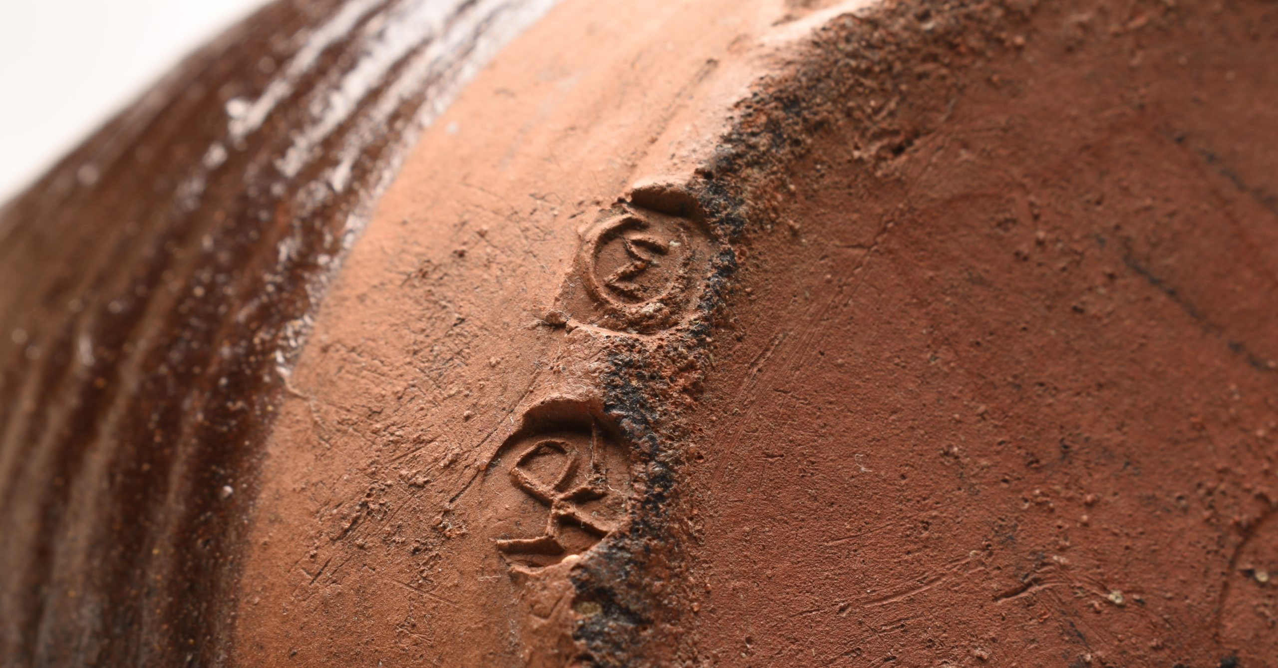
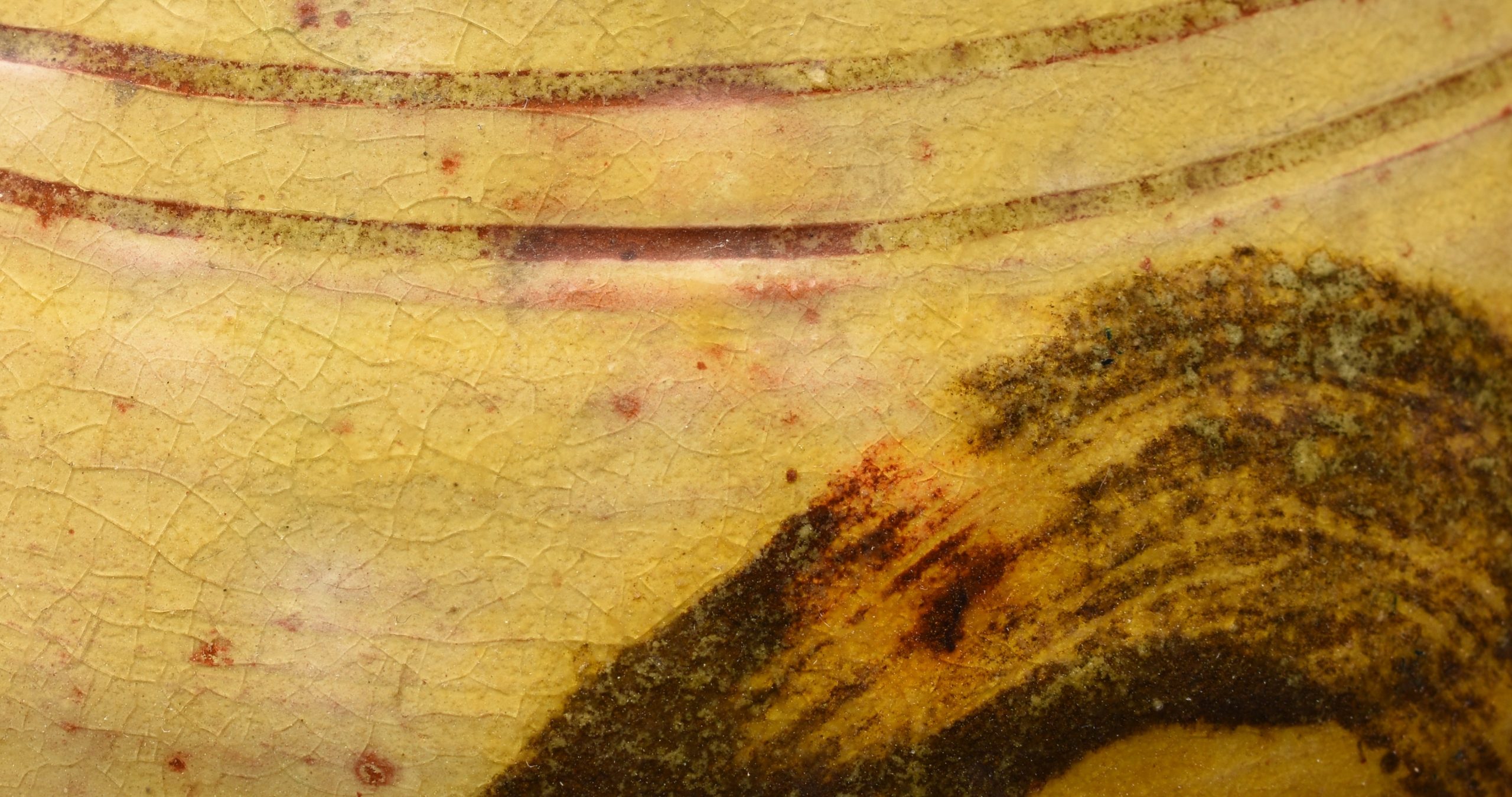
Left - A studio pottery coffee jug from the legendary potter Micheal Cardew (1901–1983) and the Winchcombe Pottery dating back to the 20th century. This jug measures approx 180mm high and 19cm wide including the handle and features a simple but effective brush frieze under the glaze in a sandy colour on a brown background. It also has both MC mark and the Winchcombe Pottery WP seal to the edge of the base. Sadly this one is missing it's lid.
Centre - A Micheal Cardew slipware jug in butter yellow with brushed decoration. Looking back to the Medieval tradition this would have been an early piece. It's also heavy when compared to the coffee pot above which is as light as a feather. MC mark to base only. 160mm high
Right - An unnamed coffee pot again missing it's lid from Winchcombe. This one has a deep honey coloured glaze. 150mm high (6 inches).
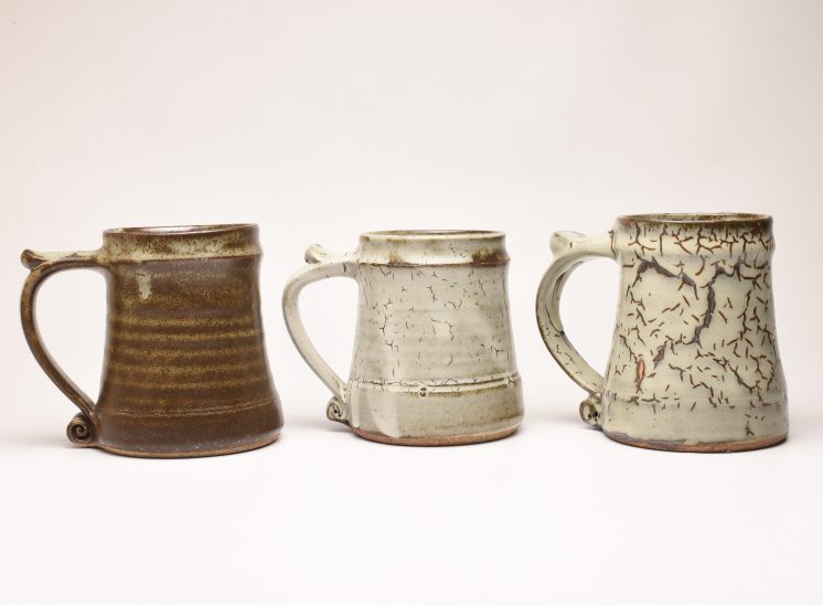
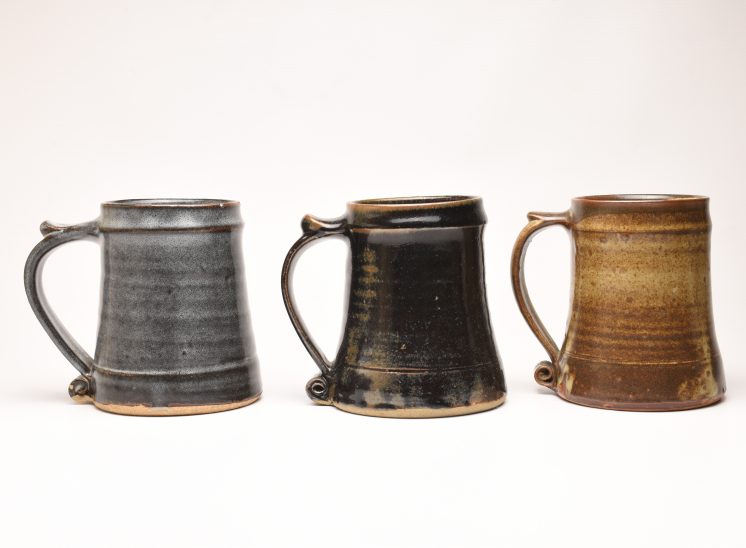
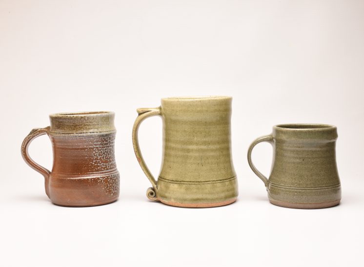
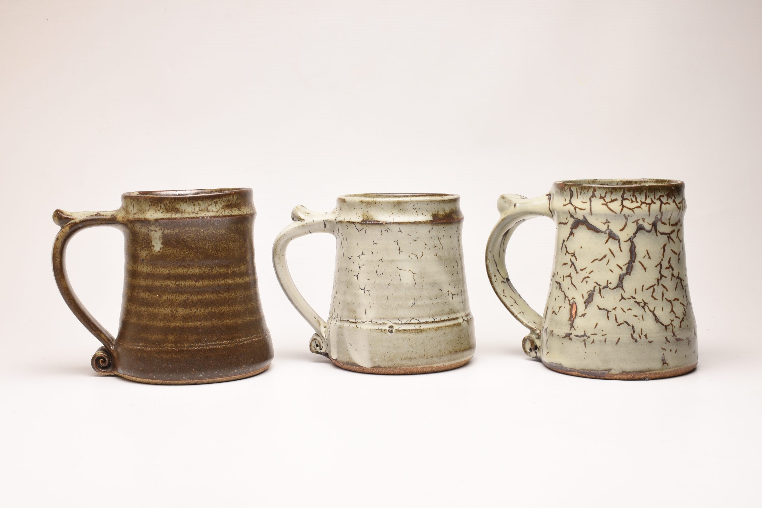
Leach Pottery Pint Tankards
"... the old Leach Pottery produced a range standard ware for many years. It was way back in the late 1930s that Bernard and David Leach started work on a range of domestic pots for everyday use. They were made to specific sizes from measured amounts of clay and became known as Leach Pottery Standard Ware. Catalogues were issued and the range stayed in production until Janet Leach decided to stop production after Bernard's death in 1979."
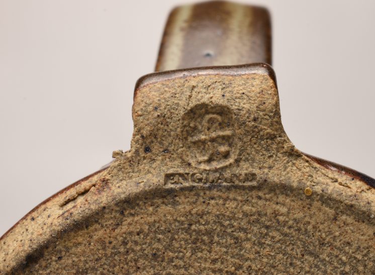
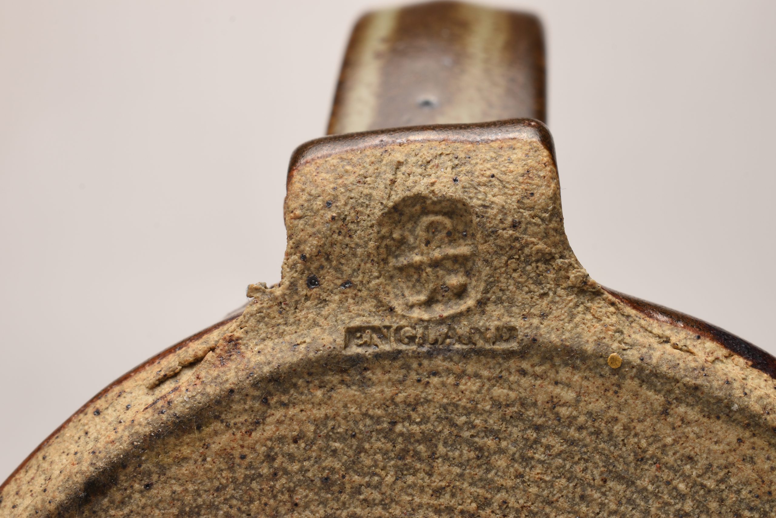
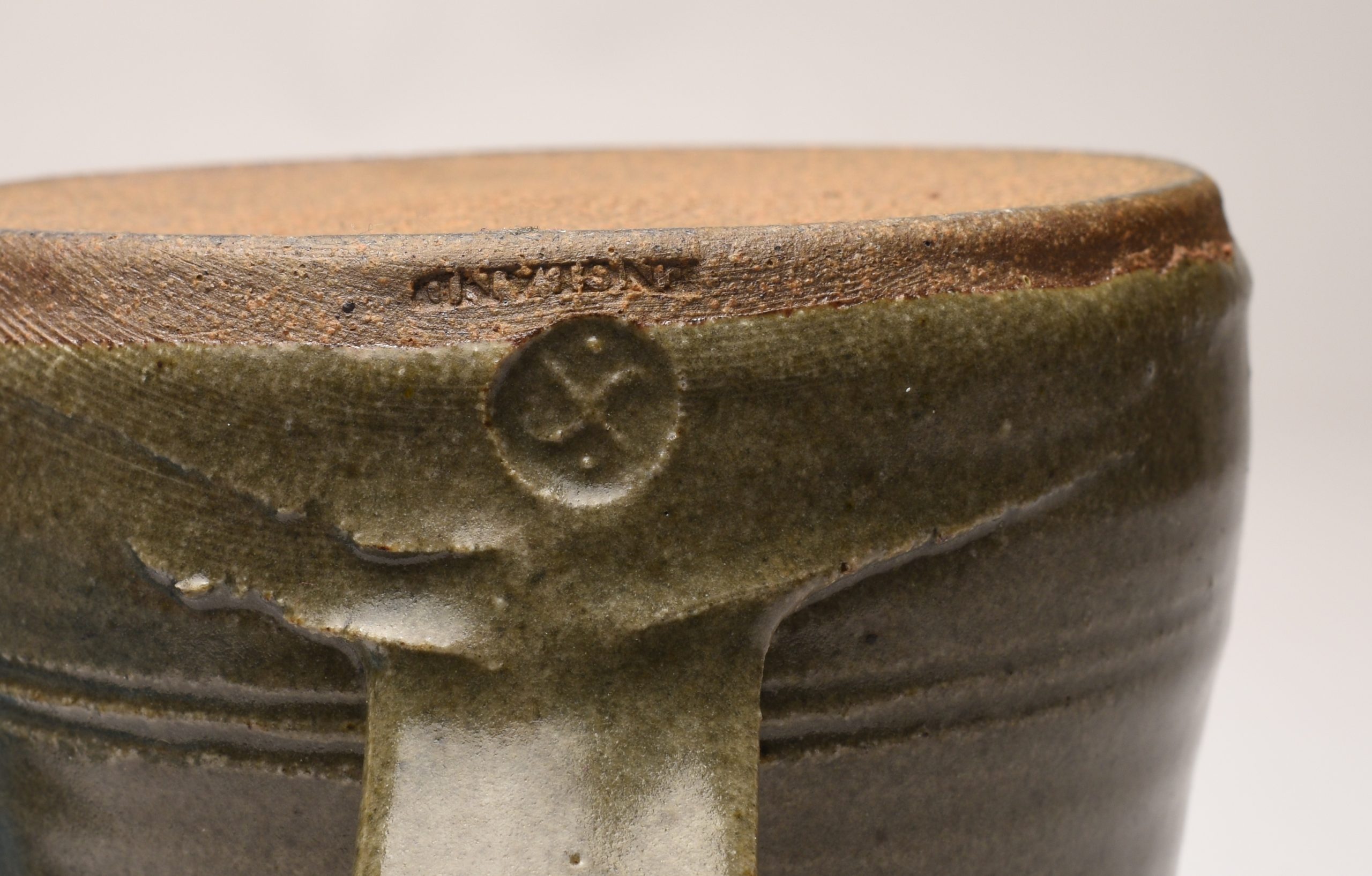
Left - A brown glaze Leach St. Ives Pottery Pint Mug. Part of the St. Ives standardware range. This one carries the ENGLAND mark and probably 60s or 70s.
Listed as "Large Beer Tankard, 1 Pint" in the catalogue. Height 140mm (just under 6 inches).
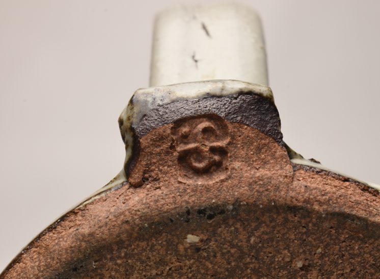
Centre & Right - These are unusual as quality at the Leach pottery was consistent. I can only assume that they are seconds and were sold as seconds. The glaze has split to give them a textured flecked appearance. I really like them, they are unusual and interesting and they add another level of interest. Right one also marked ENGLAND.
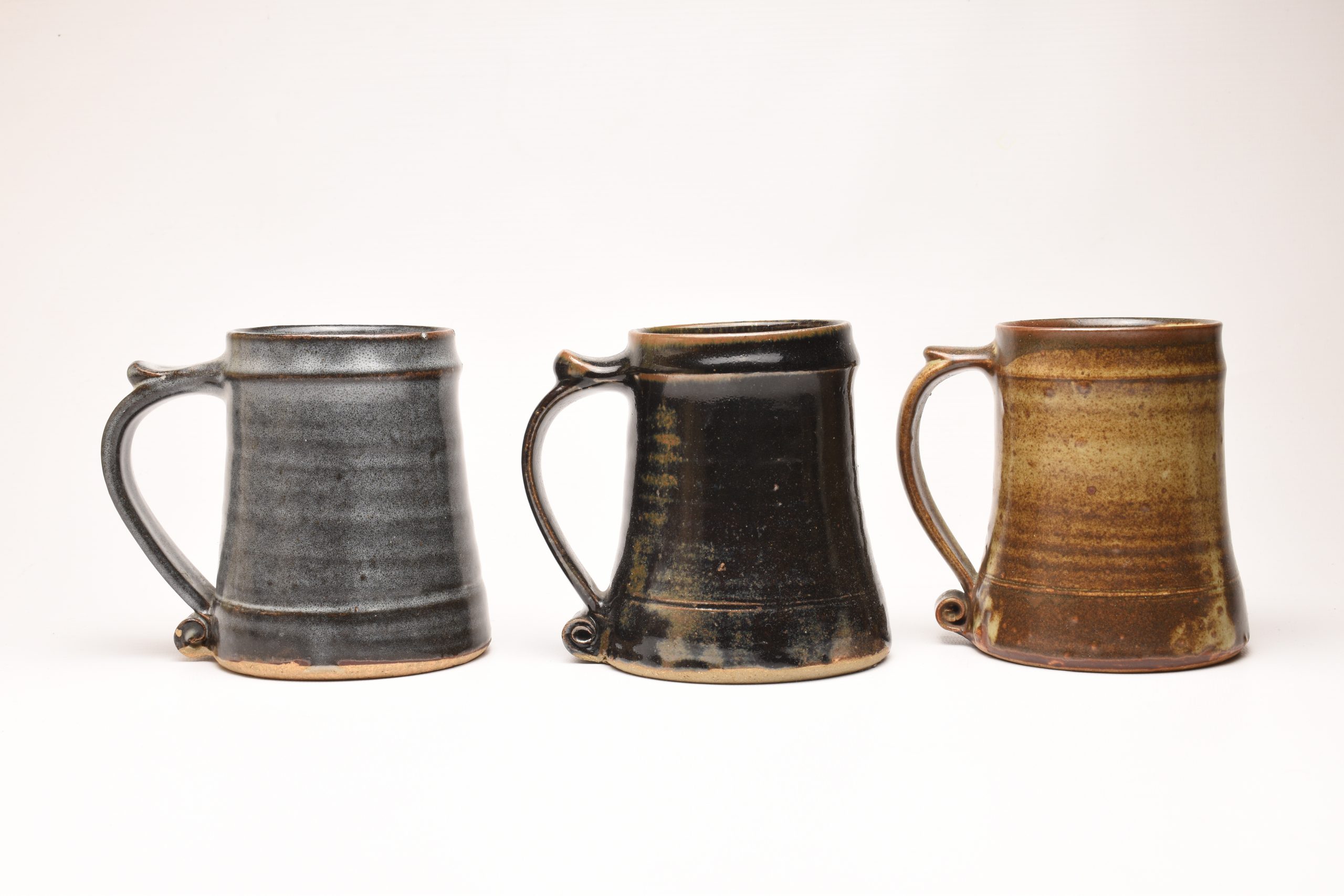
Leach Pottery Pint Tankards
Left & Centre - A Tenmoku Black glazed tankard. I believe these were produced in five different glazes;
- Brown
- White
- Black Tenmoku
- Celadon Green
- Grey
Certainly the Celadon and the brown glazes were used in the early ranges, both the grey and black examples shown here also carry the ENGLAND mark on the front of the vessel as well as the St. Ives mark pictured. 125mm High (approx 6 inches).
Right - Another version of the brown glaze.
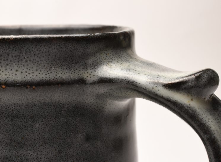
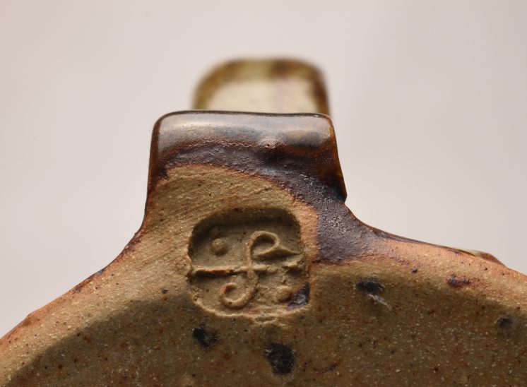
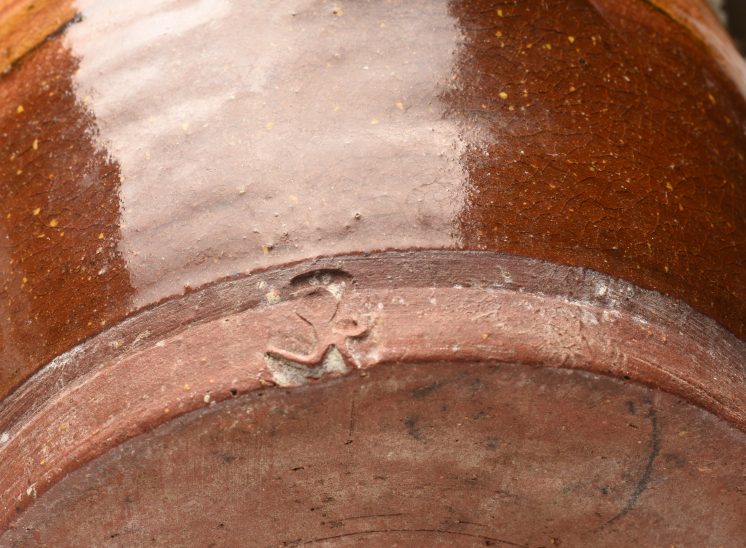
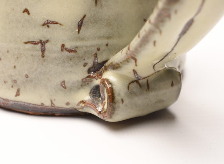
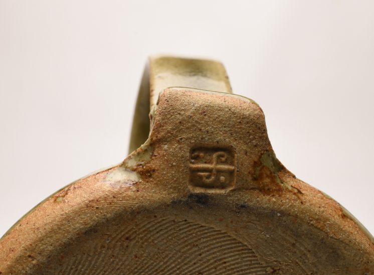
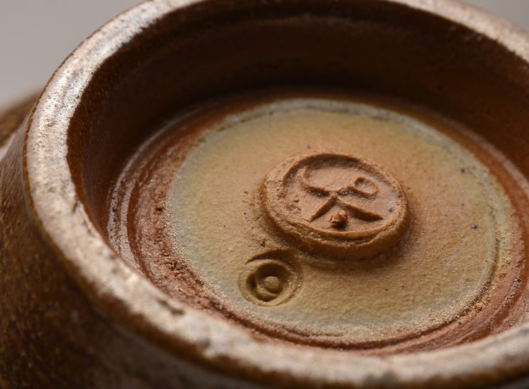
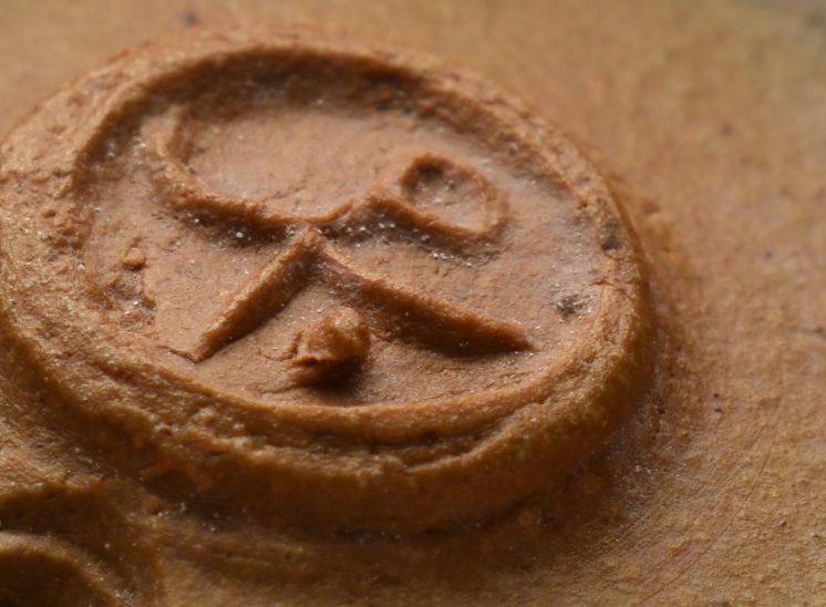
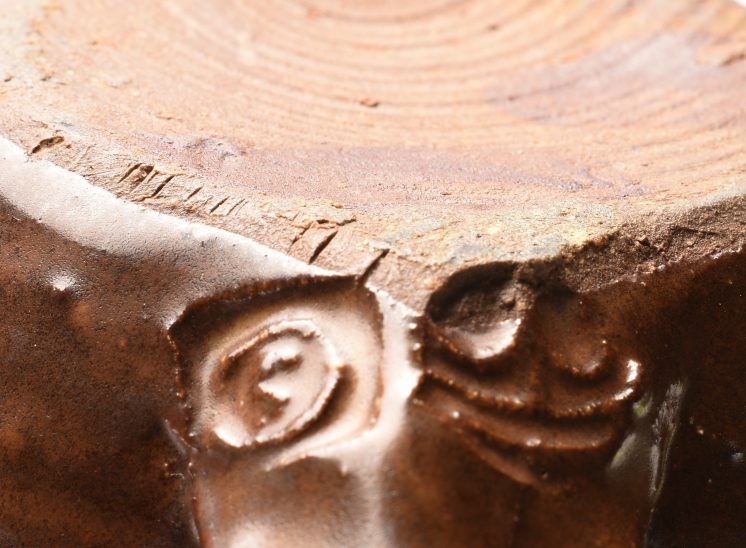
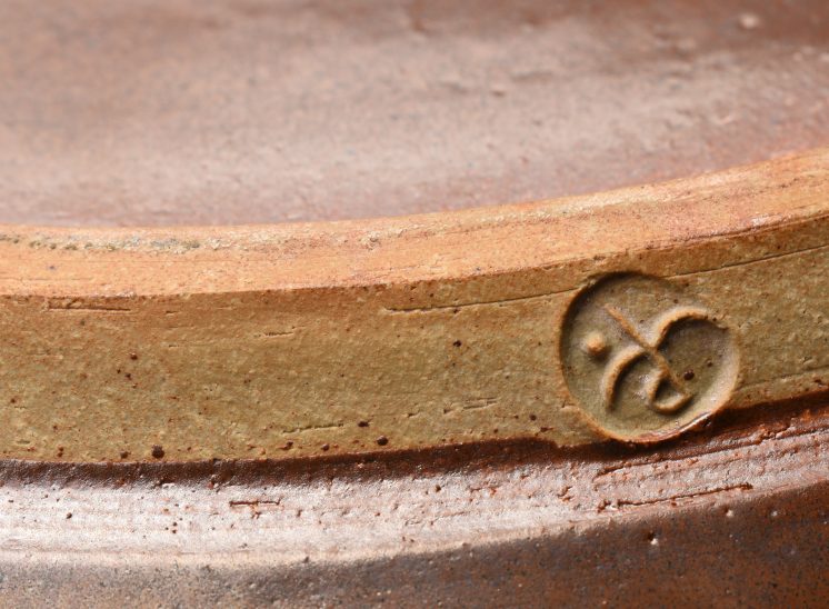
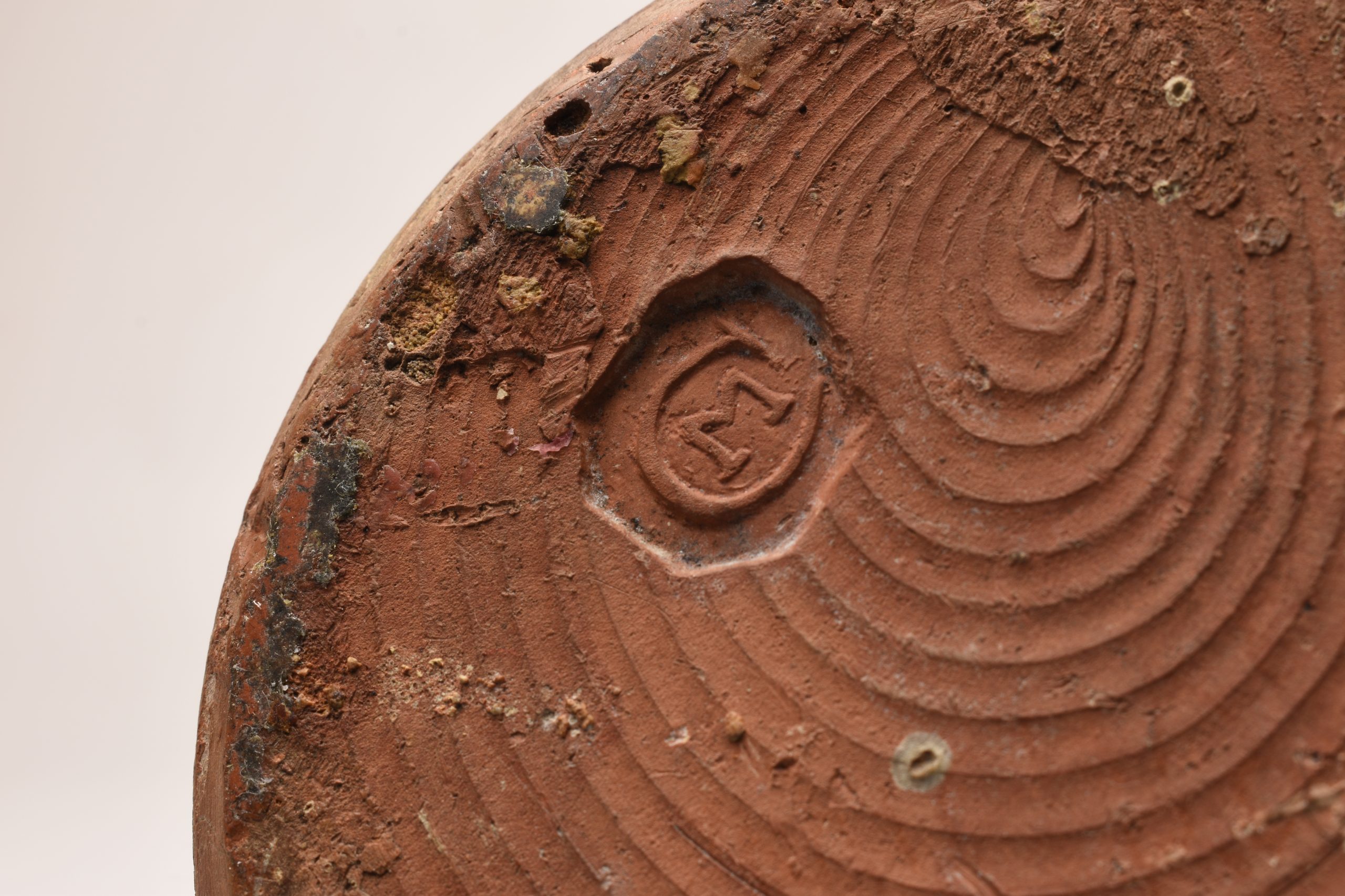
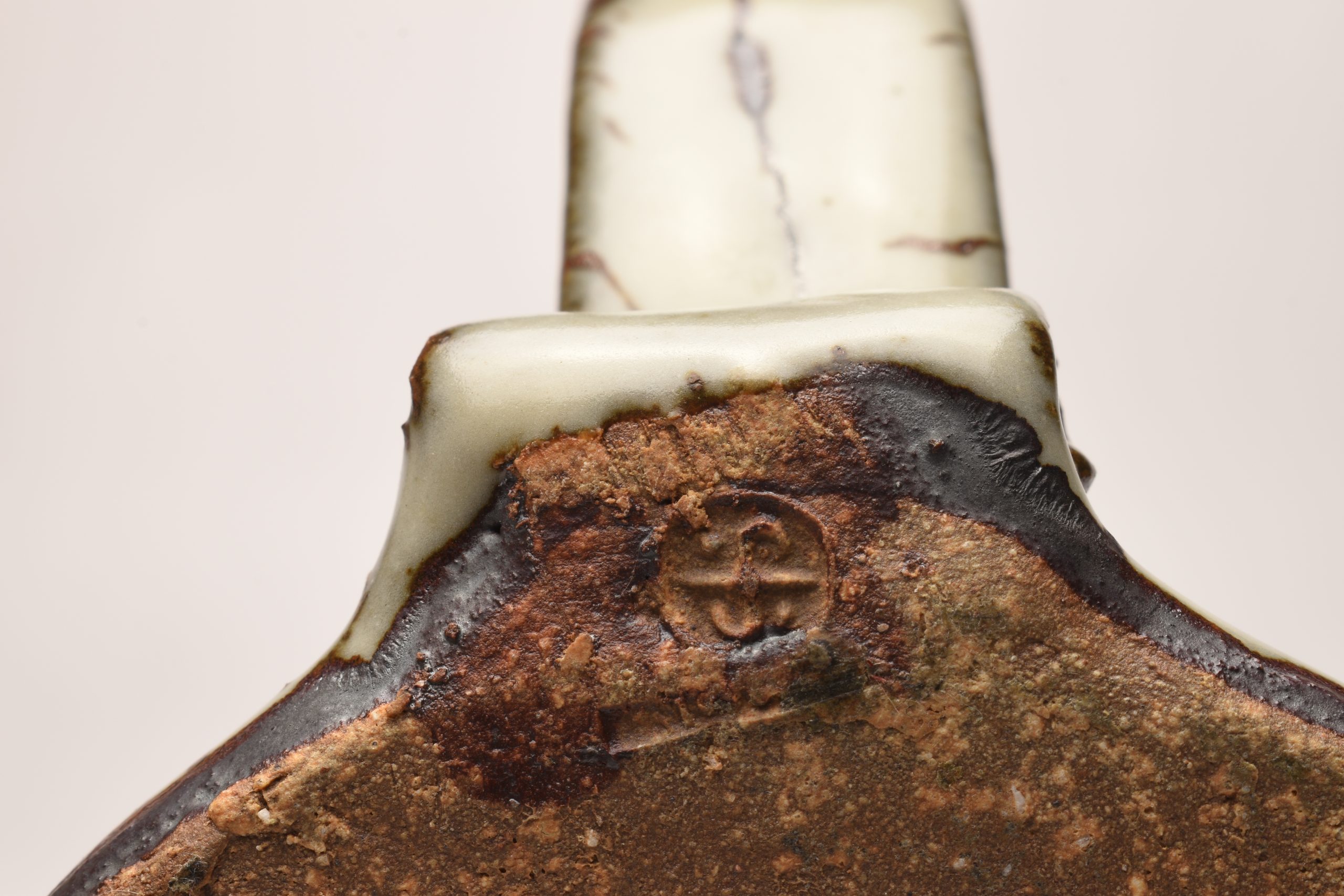
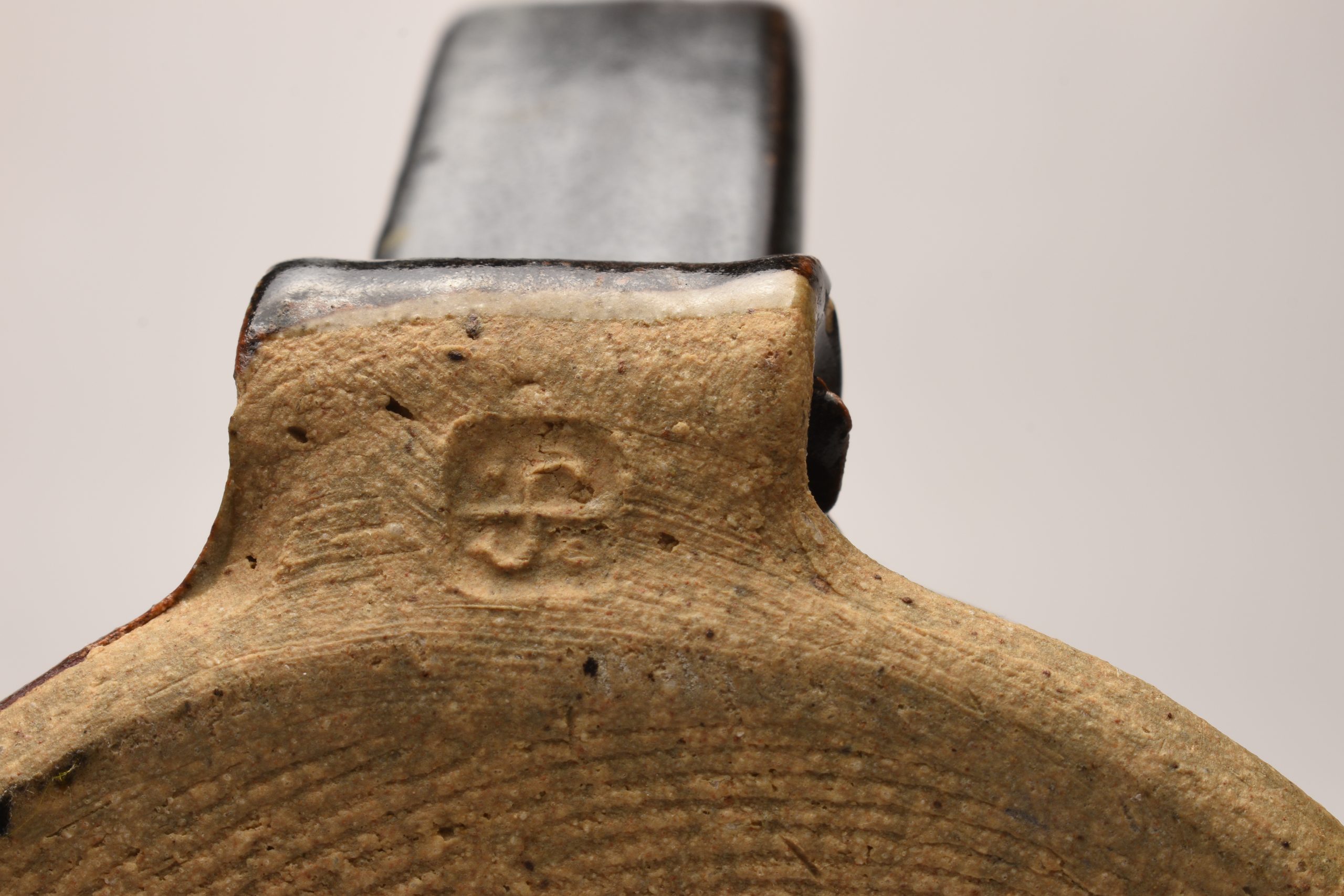
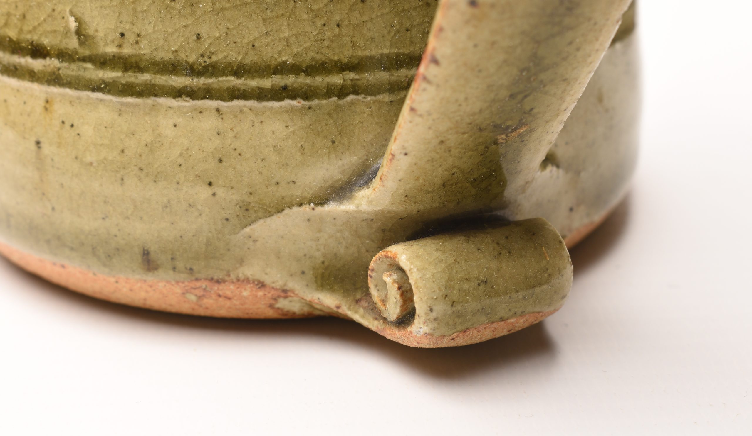
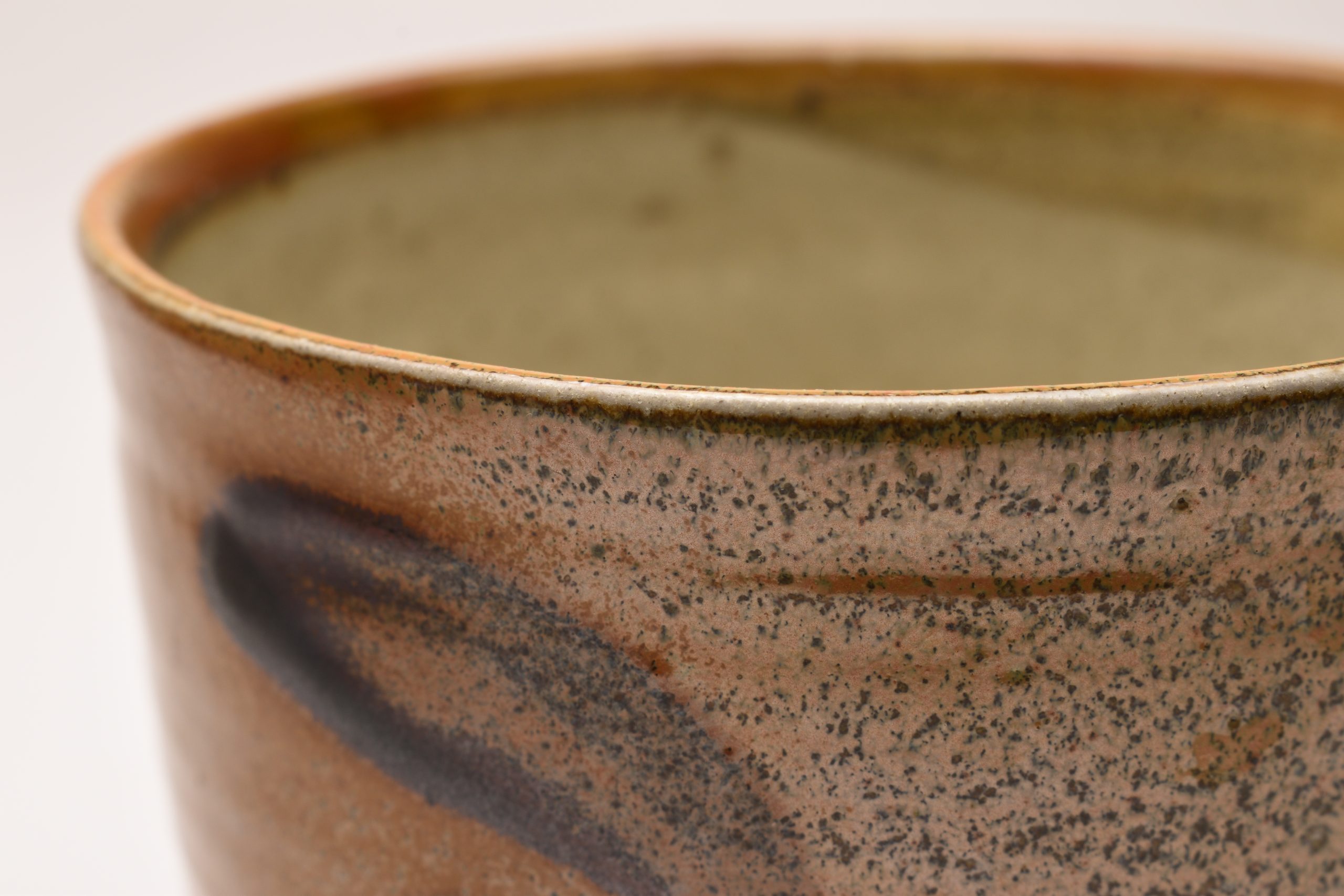
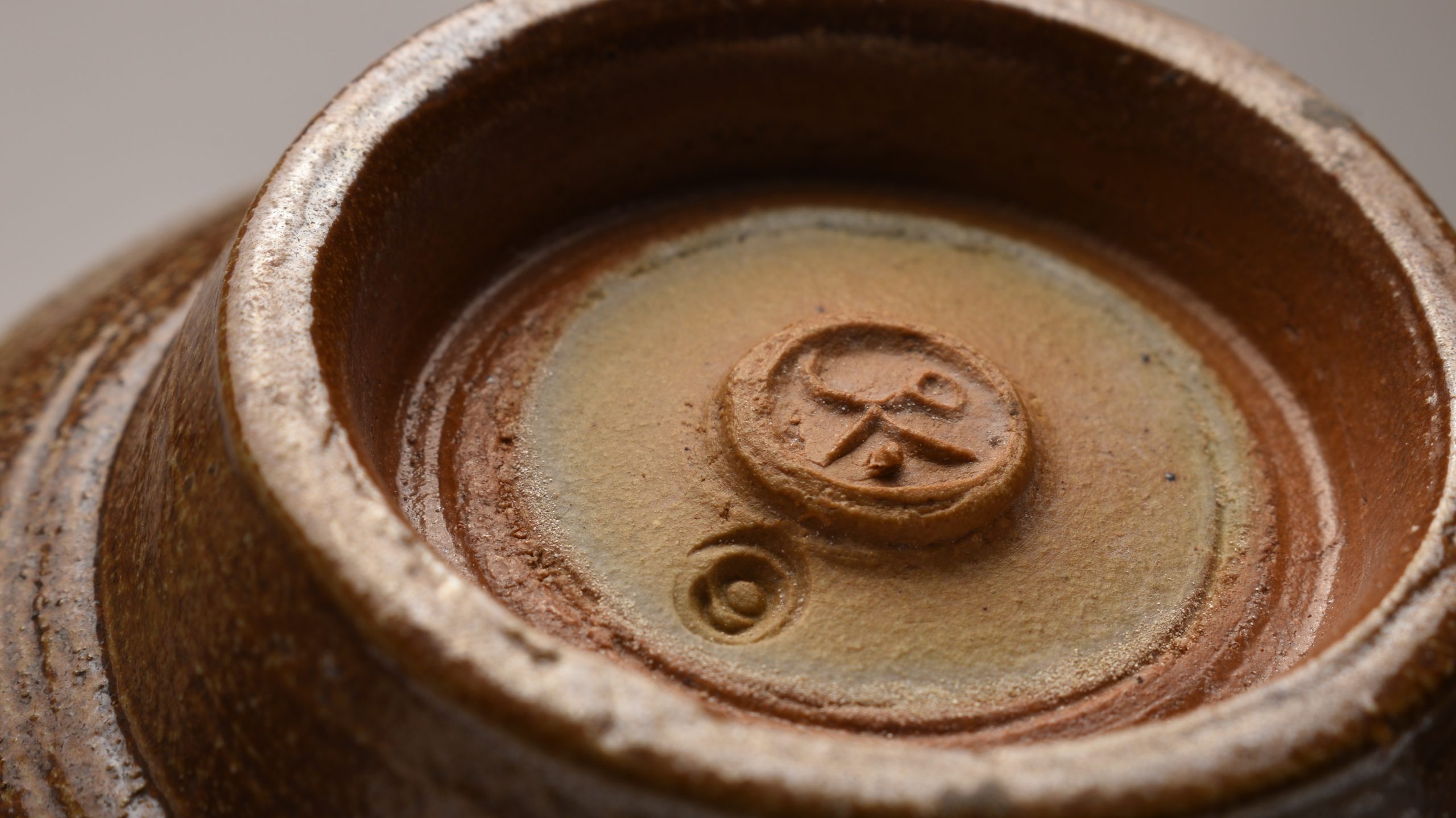
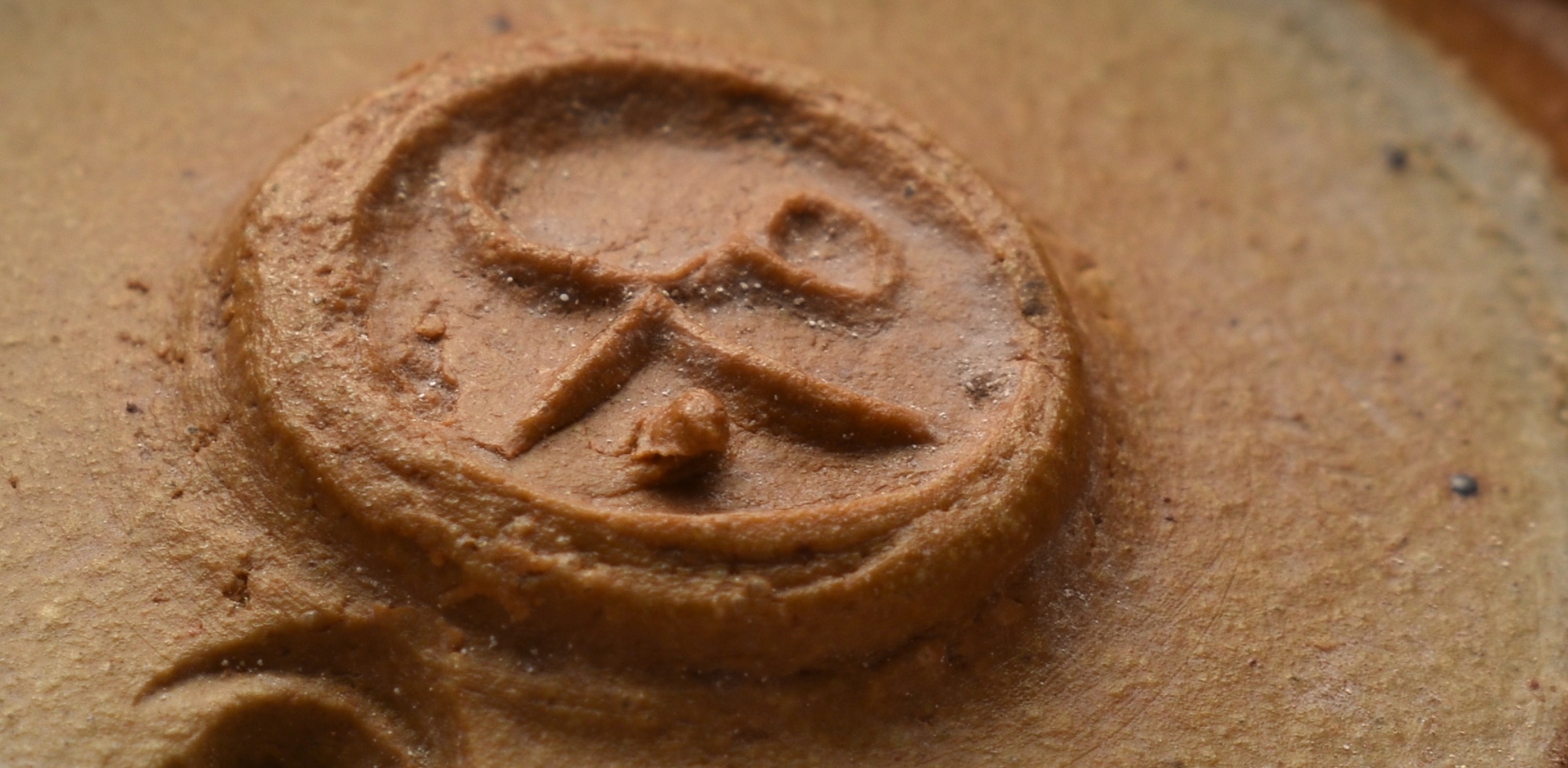
Ray Finch Saltgalze Tankard
Leach Pottery Tankard
Left - A Ray finch Saltgalze stoneware tankard with his personal seal. The dot beside the Winchcombe Pottery mark meas it's by Ray himself.
Centre - An Leach Pottery St. Ives Pint Tankard in Celadon green glaze.
Right - An Leach Pottery St. Ives Half-Pint Tankard in Celadon green glaze. These are not as common. Men did not drink out of half pint mugs and this would have been for a women. Women would not have used pint mugs. 90mm (3 1/2 inches) high. Also carries the ENGLAND mark. impressed.
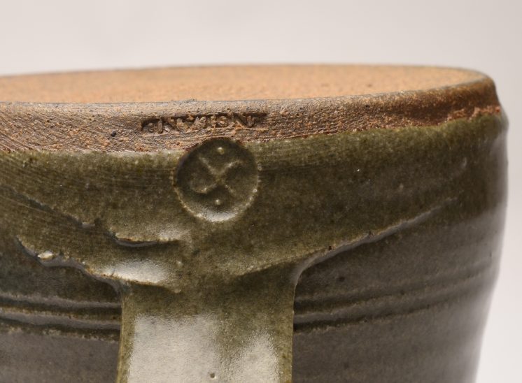
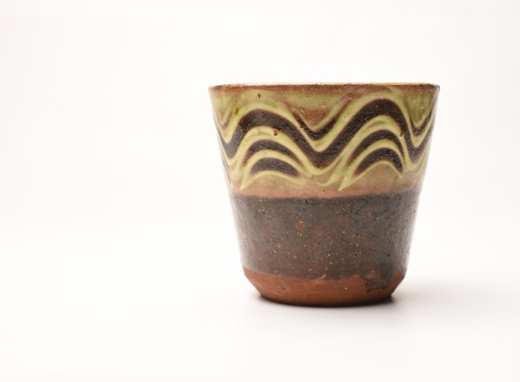
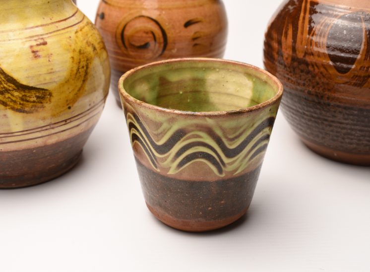
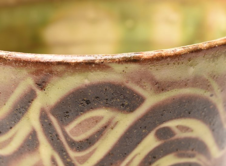
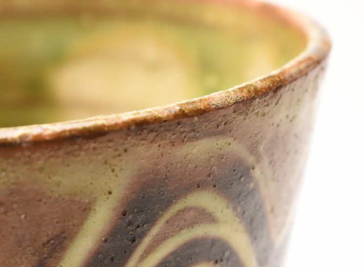
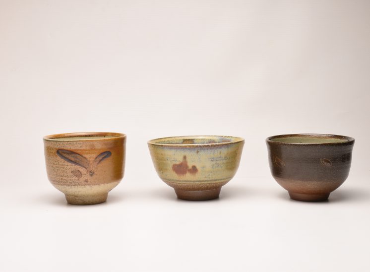
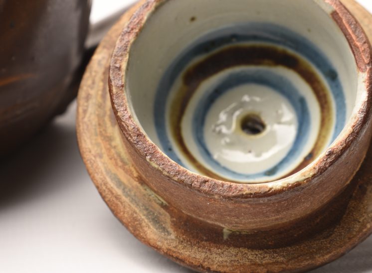
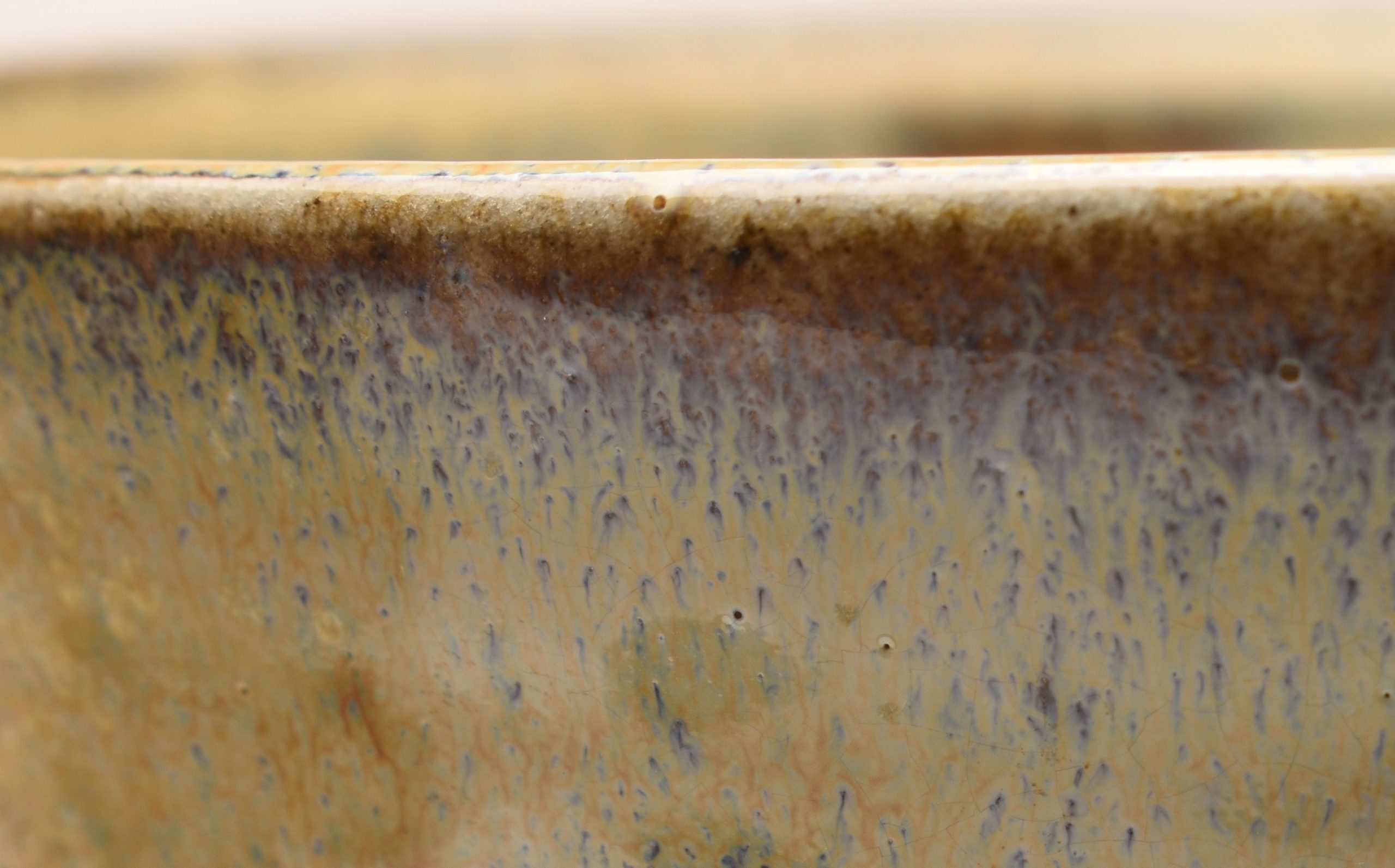
Ray Finch Teabowls
These would be later teabowls, certainly not early in style. They are all very crisp and clean and carry the same impressed WP Winchcombe Pottery mark with Ray's dot.
Left - Orange/Brown. Incised C. 100mm diamater
Centre - Yellow. Impressed 9. 120mm diamater
Right - Dark Brown. Incised N. 100mm diamater
They all carry a additional letter mark, I believe this is a glaze letter.
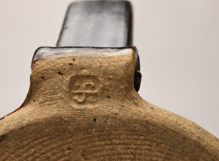
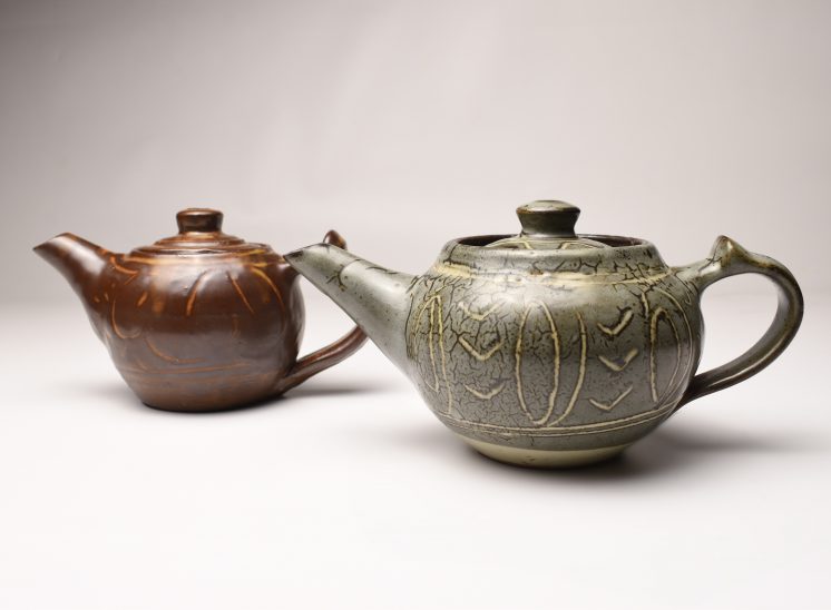
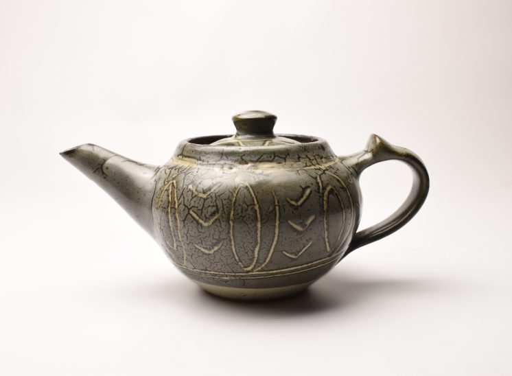
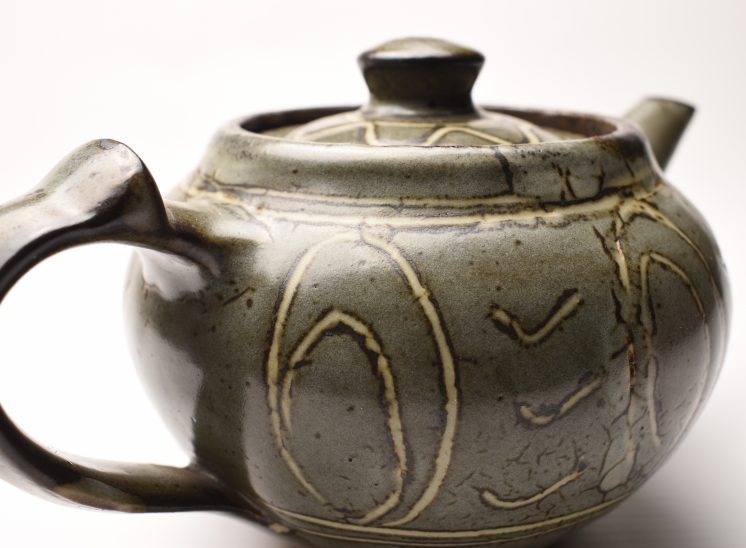
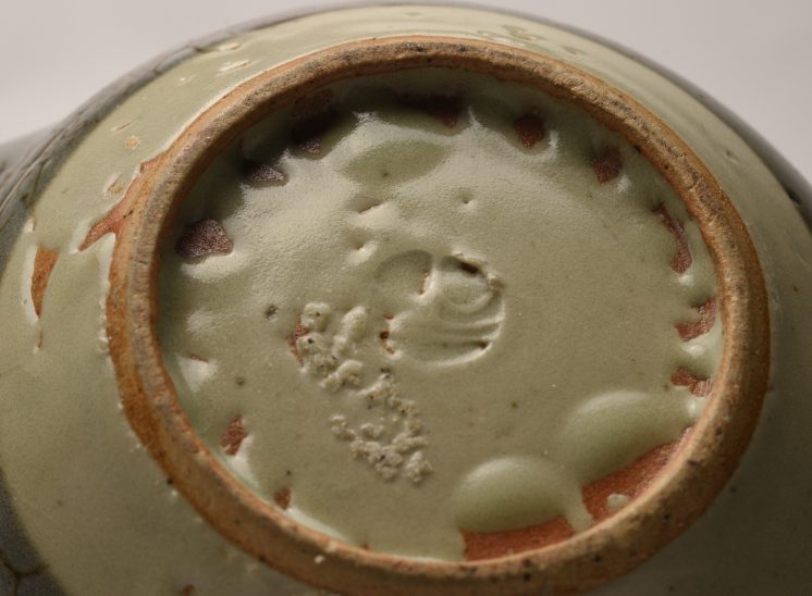
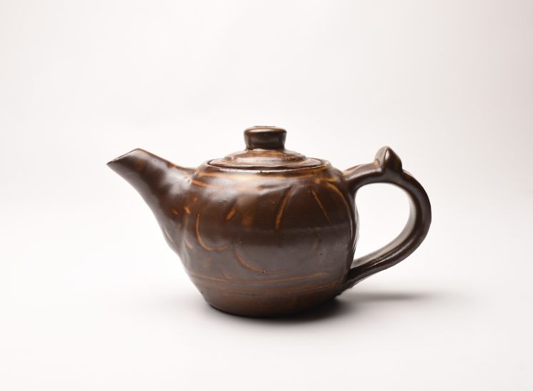
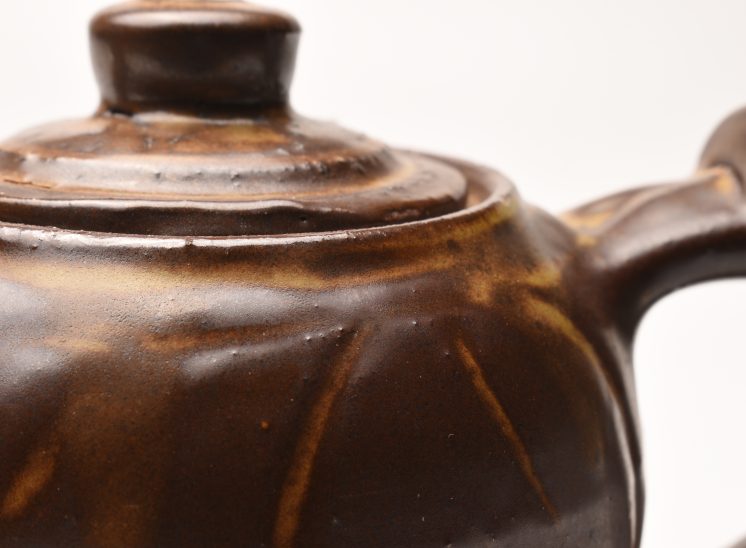
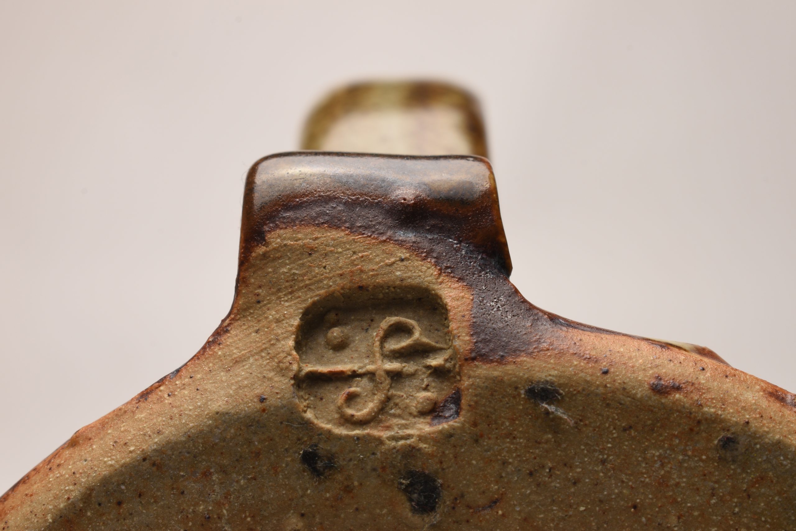
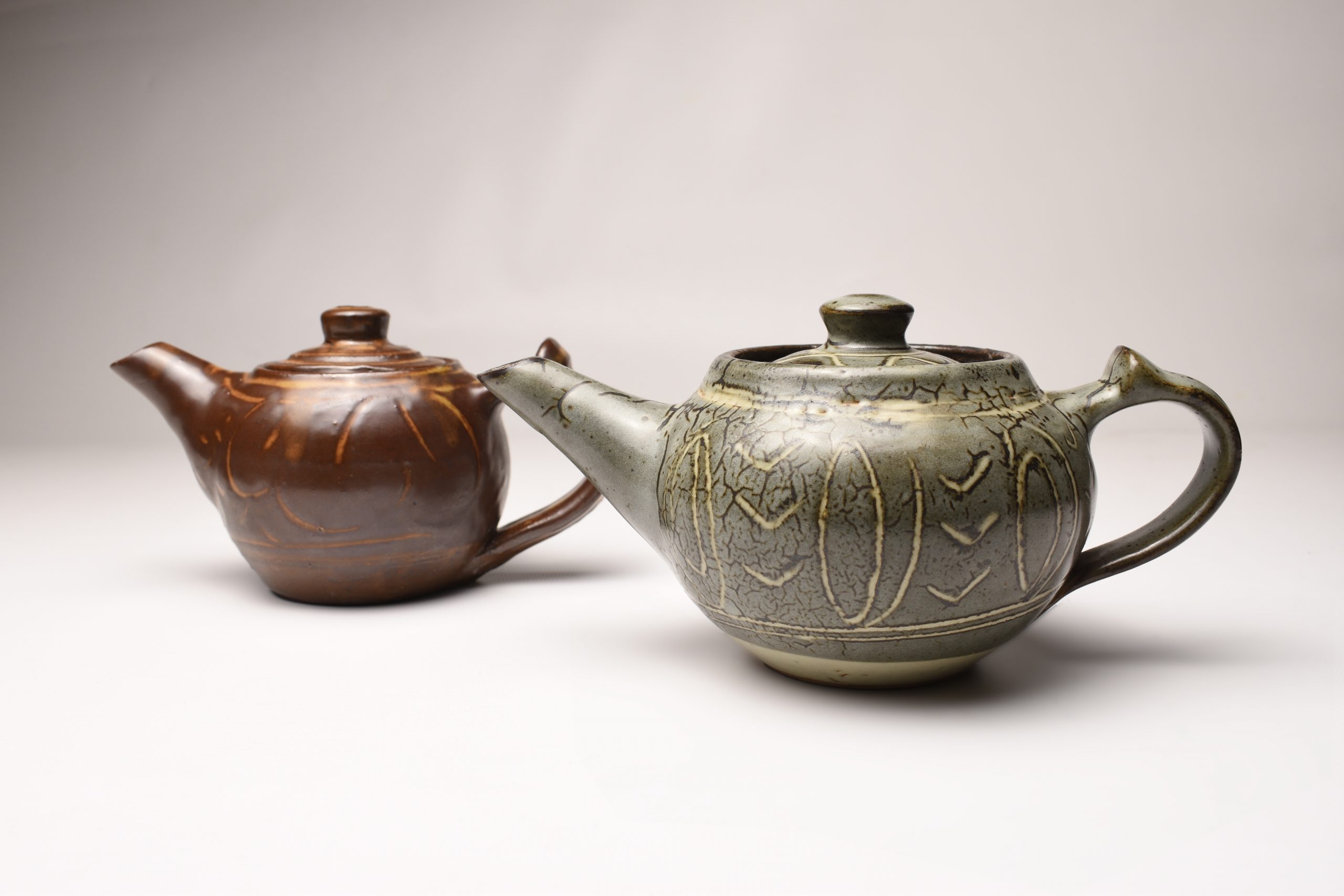
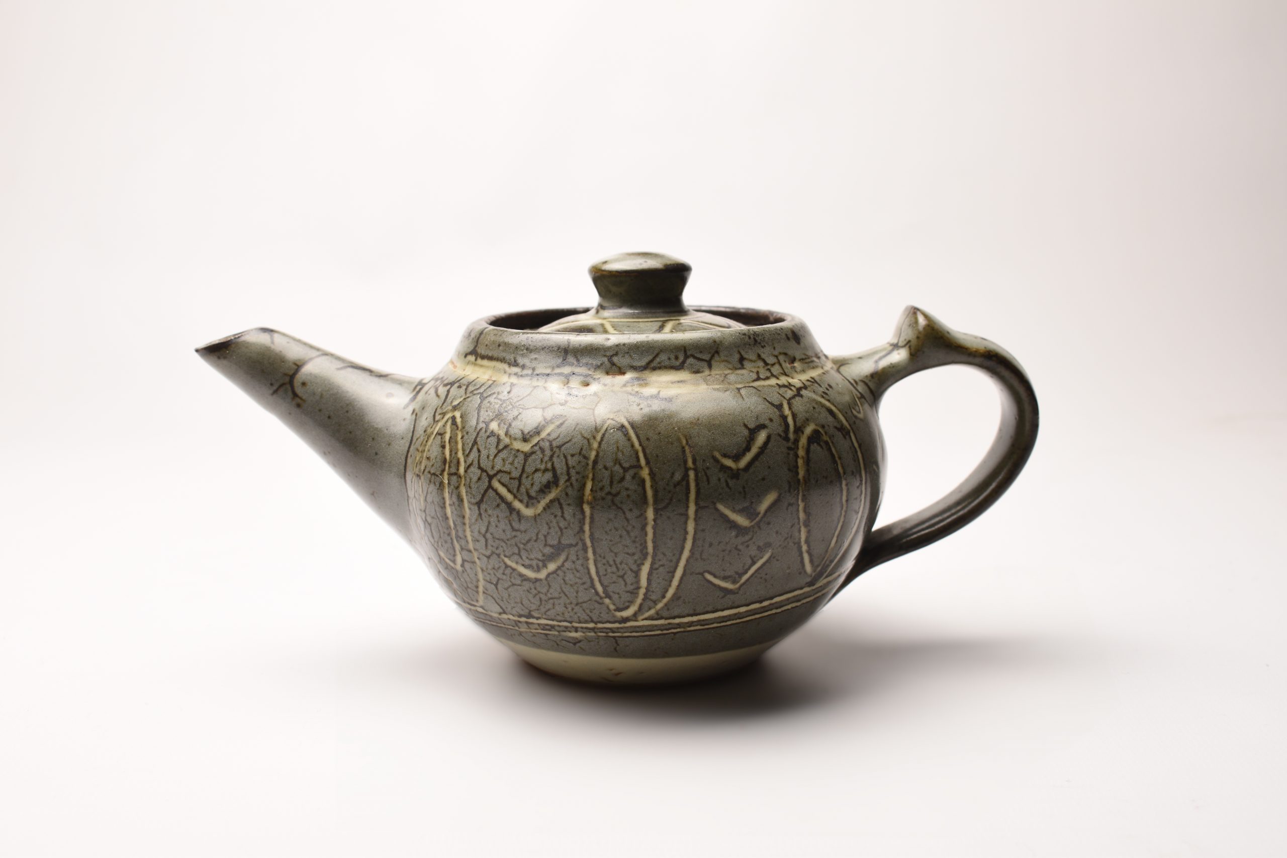
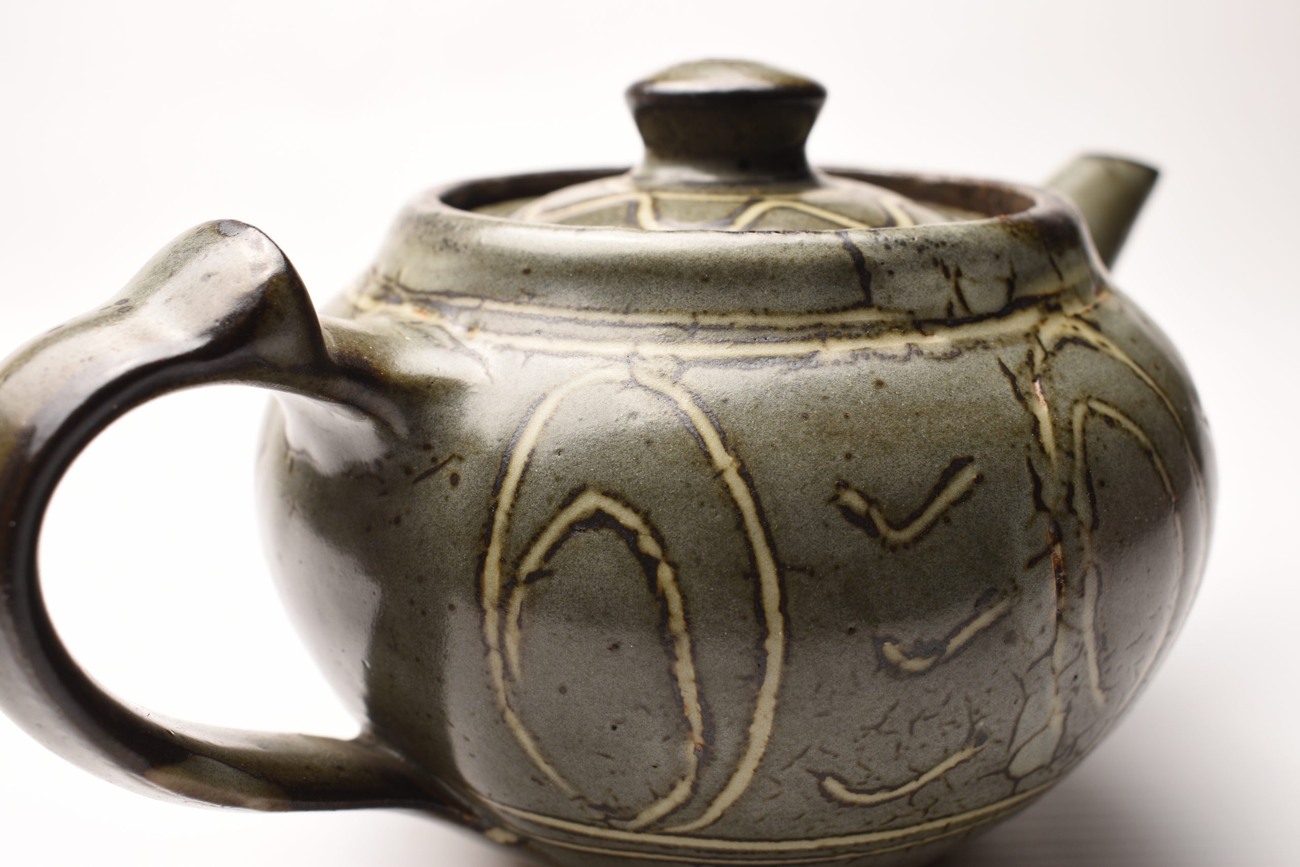
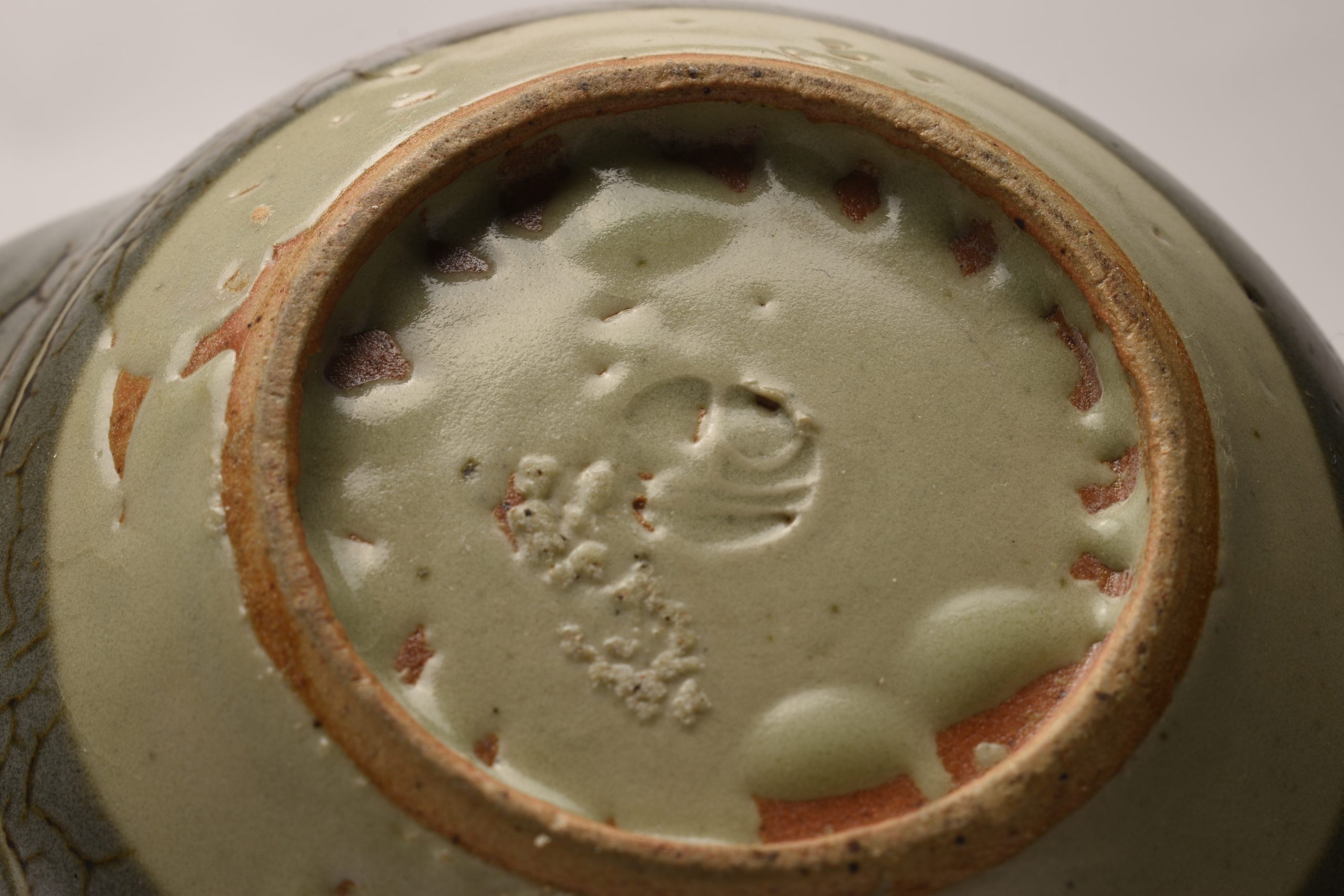
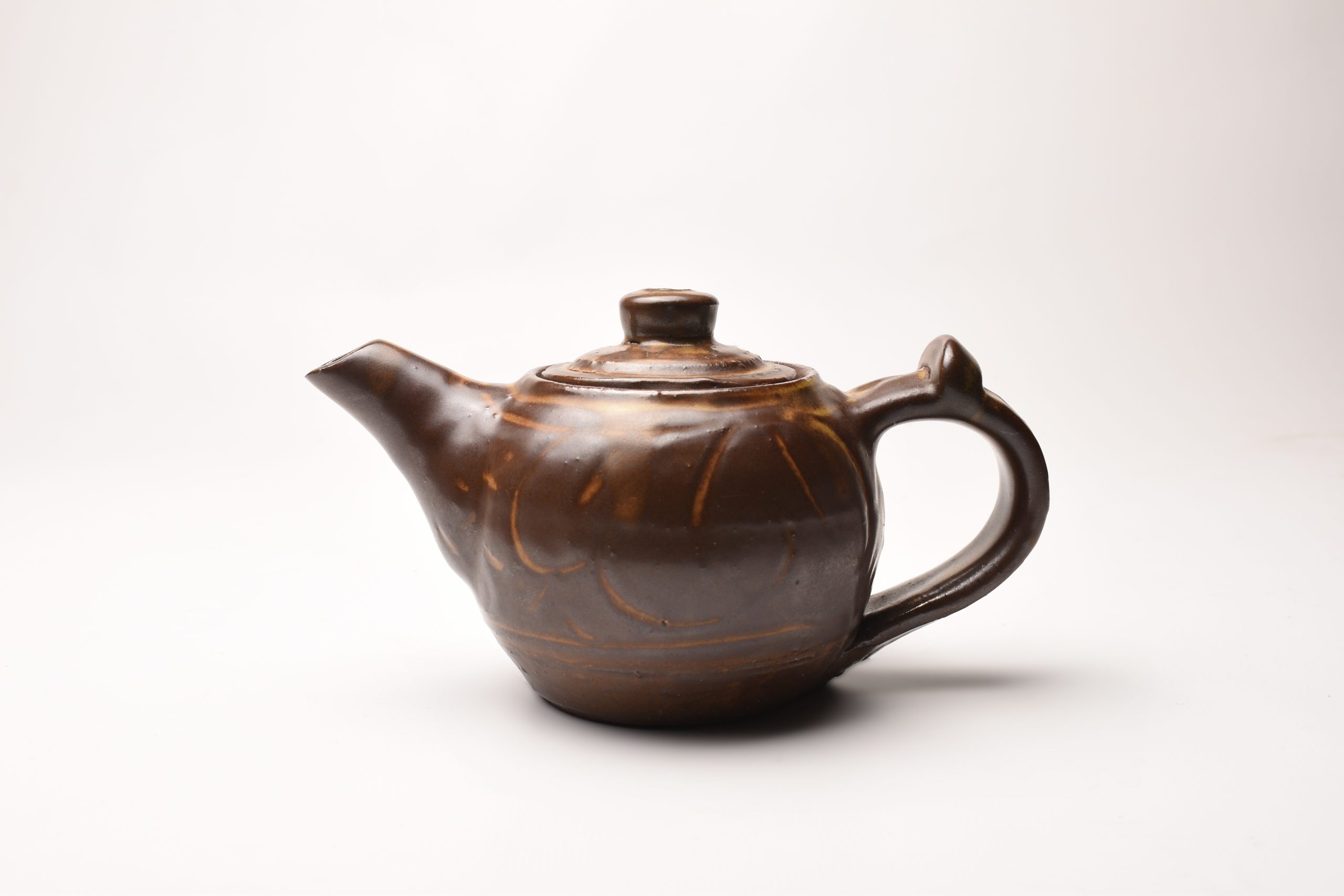
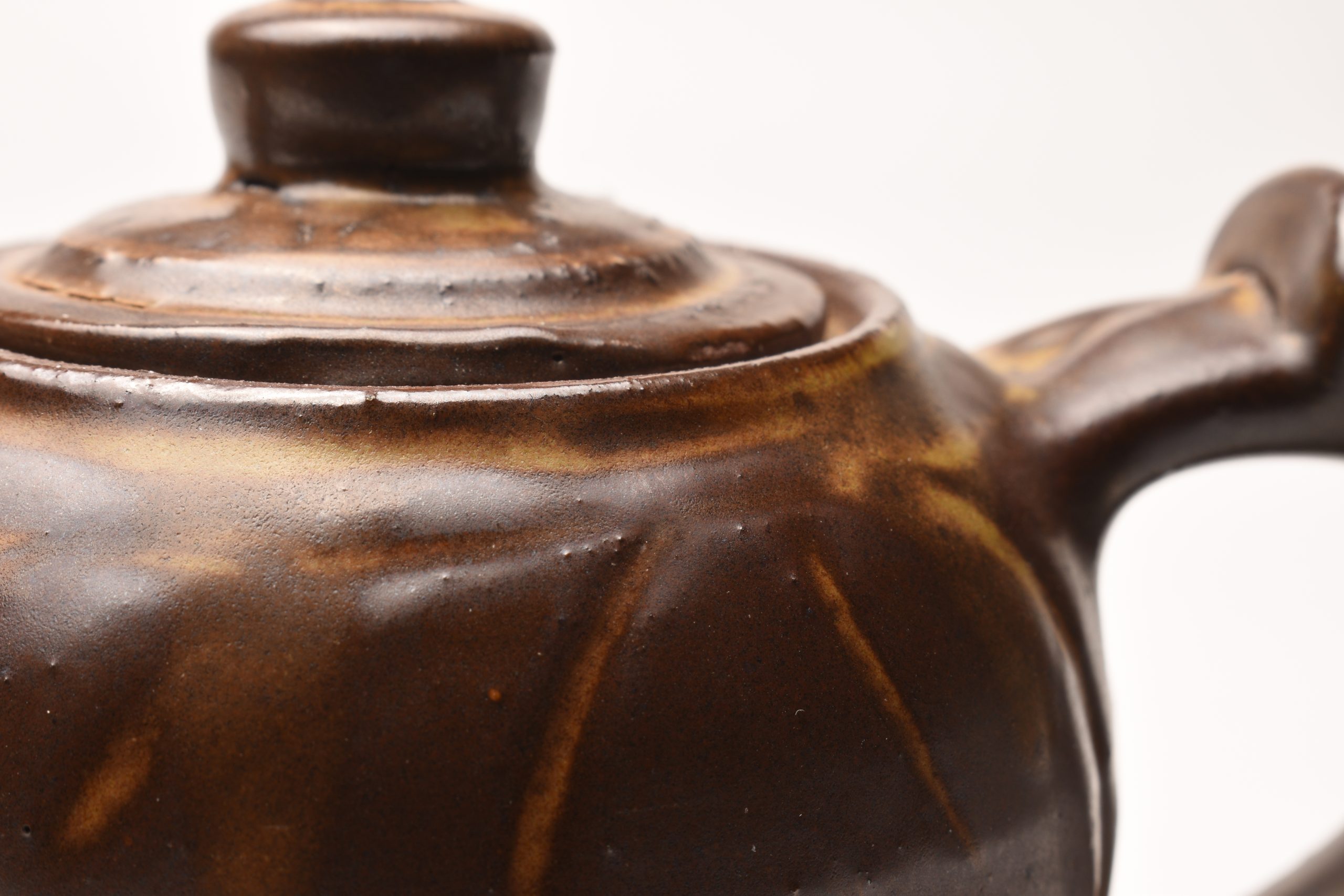
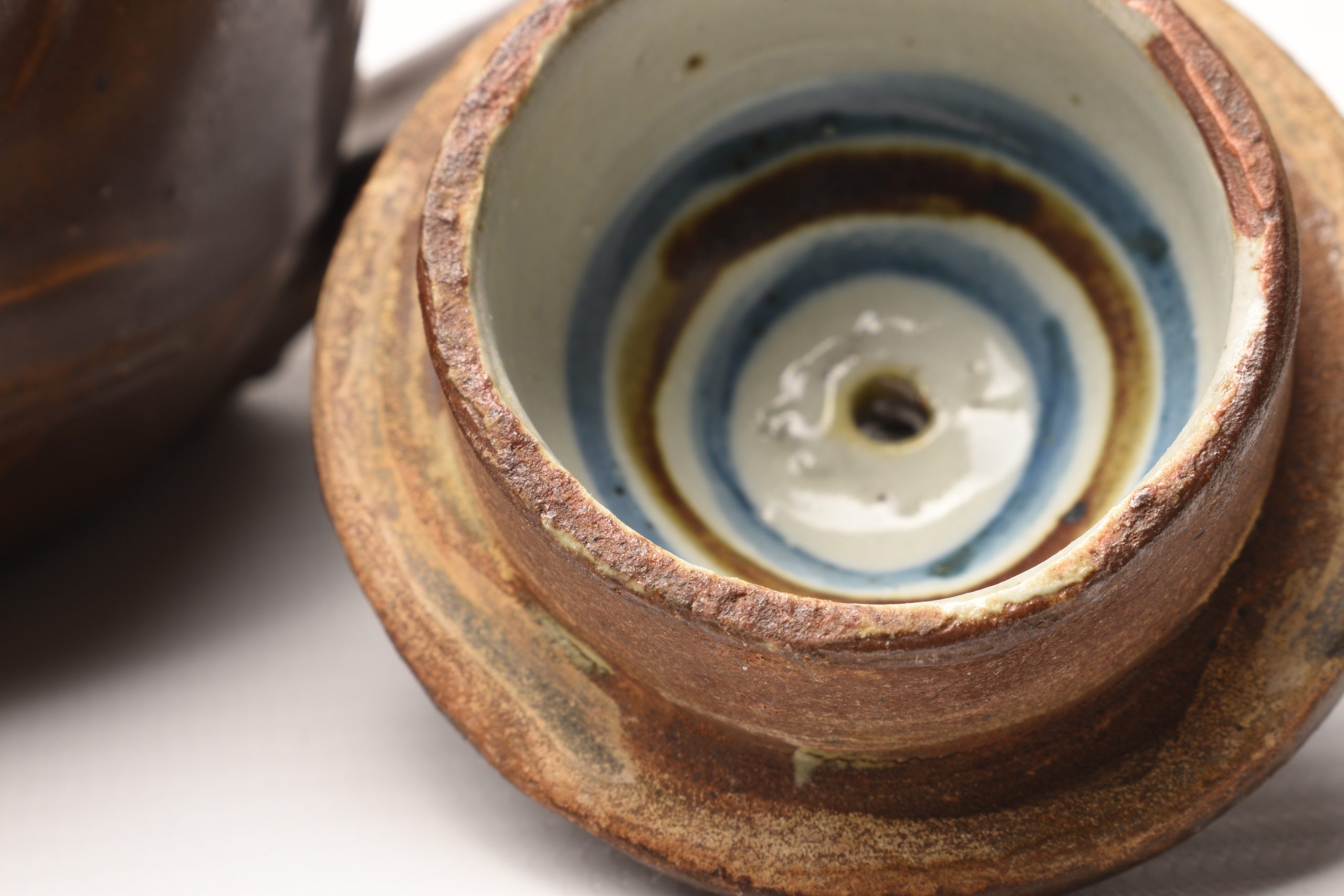
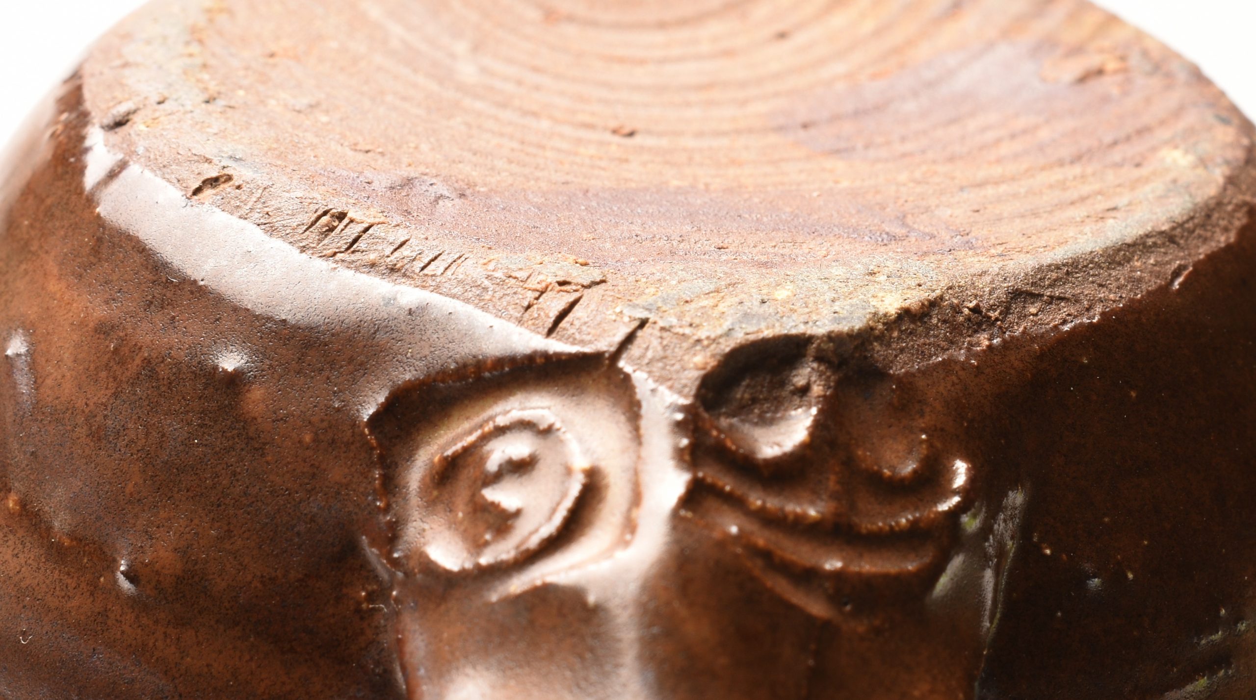
Seth Cardew Teapot
Wenford Bridge Teapot
Two miniature teapots. These came together and both carry the Wenford Bridge mark.
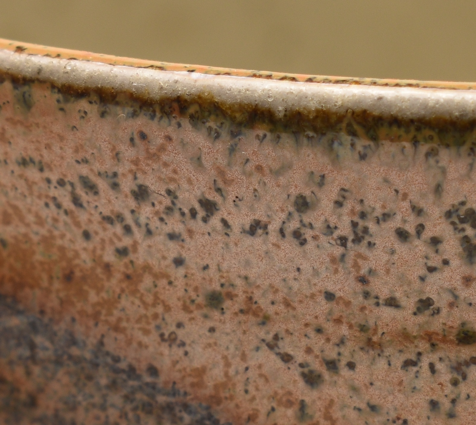
Left - 165mm lonf. Brown glaze. Not totally successful. The glaze has obscured some of the desolation below but the decorator has bothered to paint blue and brown circles in both the lid and the base of the which is a nice touch. I checked this one out and it only holds about 240ml of liquid which is just about one teacup, just... The mark is an S for Seth Cardew (1934 - 2016), Micheal's son.
Right - 195mm long. Blue/Grey glaze. This has the same split glaze issue as the white Leach Tankards above. The Wenford Bridge mark is visible but if any other seal exists it's been obscured by the glaze. We will all have to wait for handled x-ray machines build into our phones.
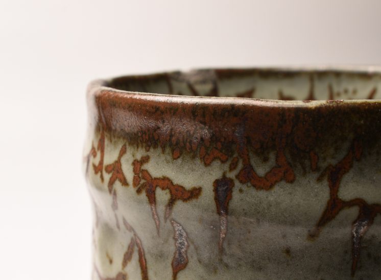
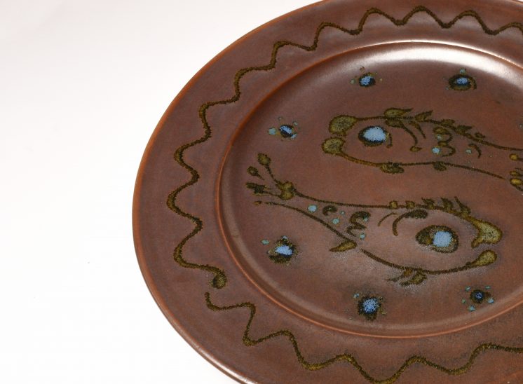
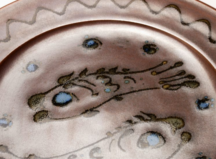
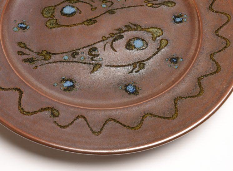
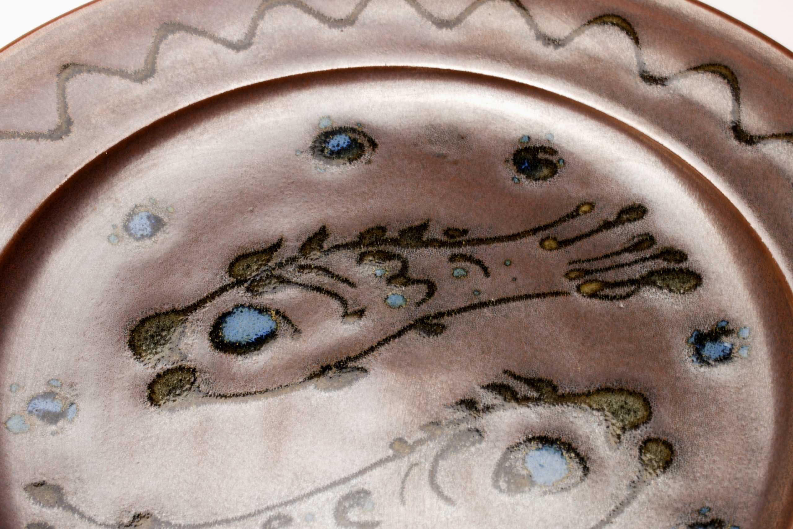
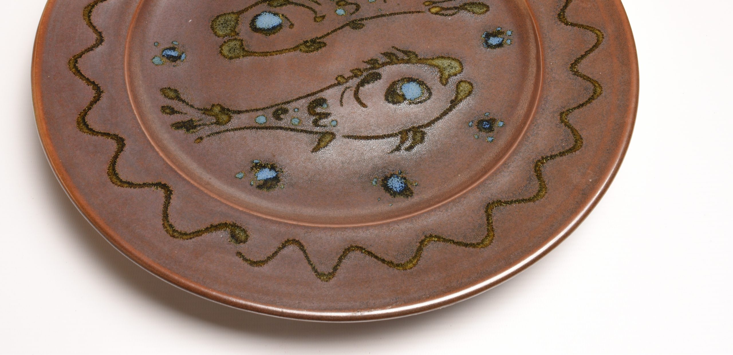
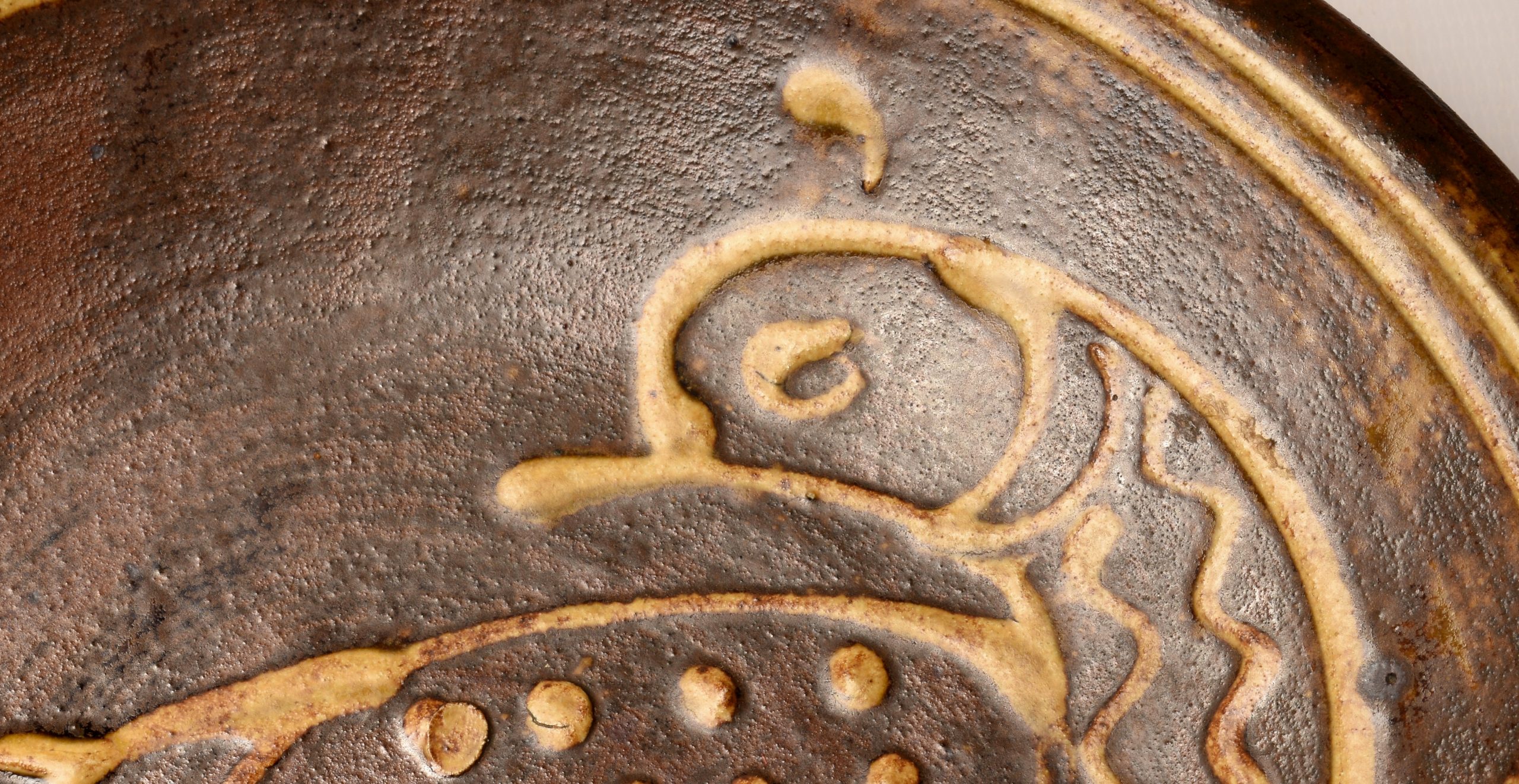
Ray Finch Fish Plate
These large platters by Ray Finch (1914-2012) are not uncommon. I remember I missed out on one of the yellow poured glaze plates and I still regret being the under-bidder. This one is stoneware and 350mm diameter (14 inches). Two carp as decoration. This one carries his personal seal on the base rim.
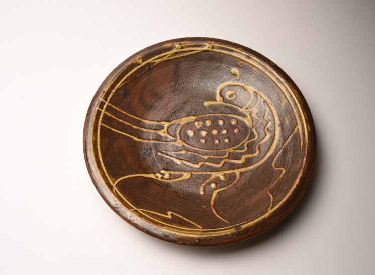
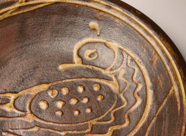
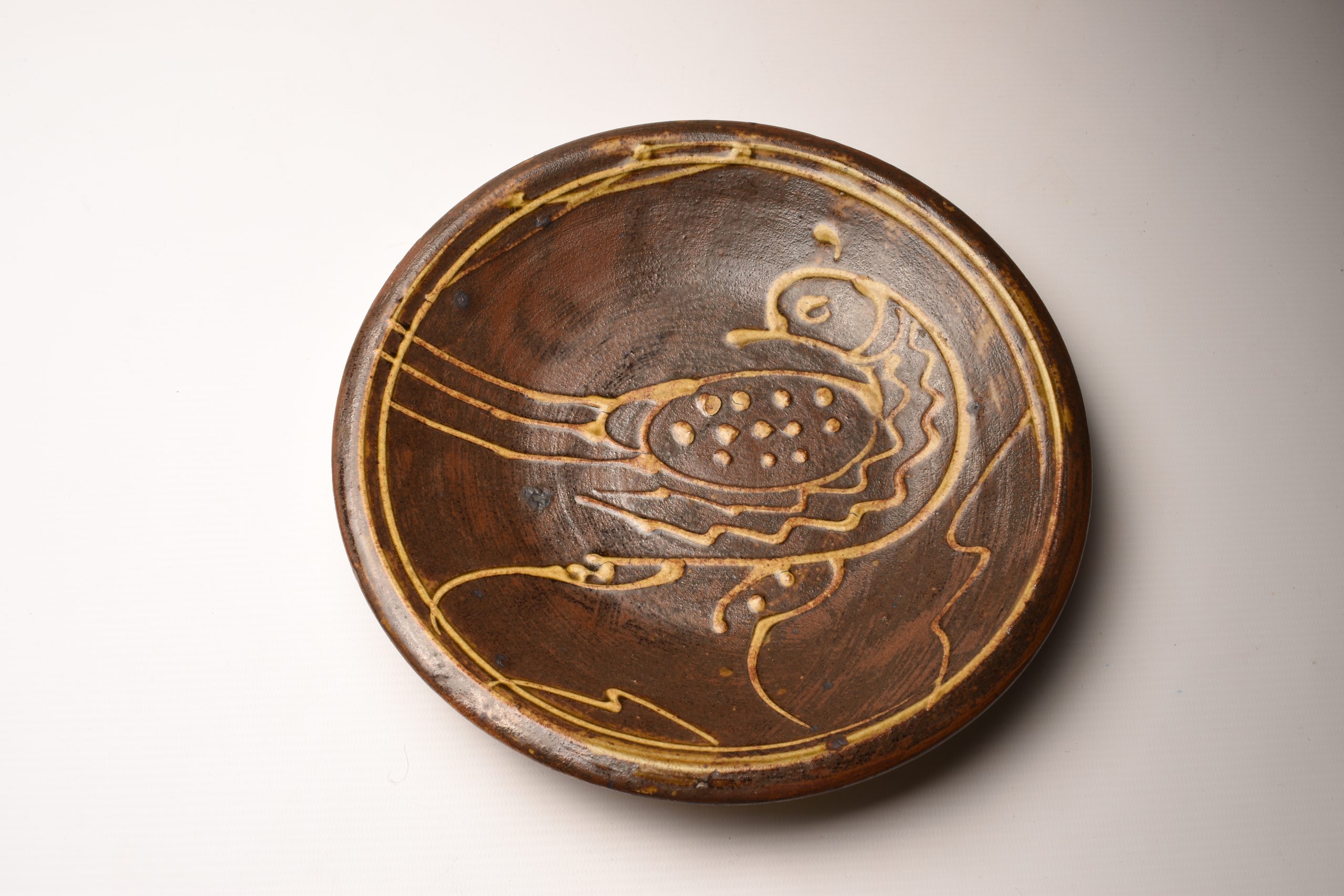
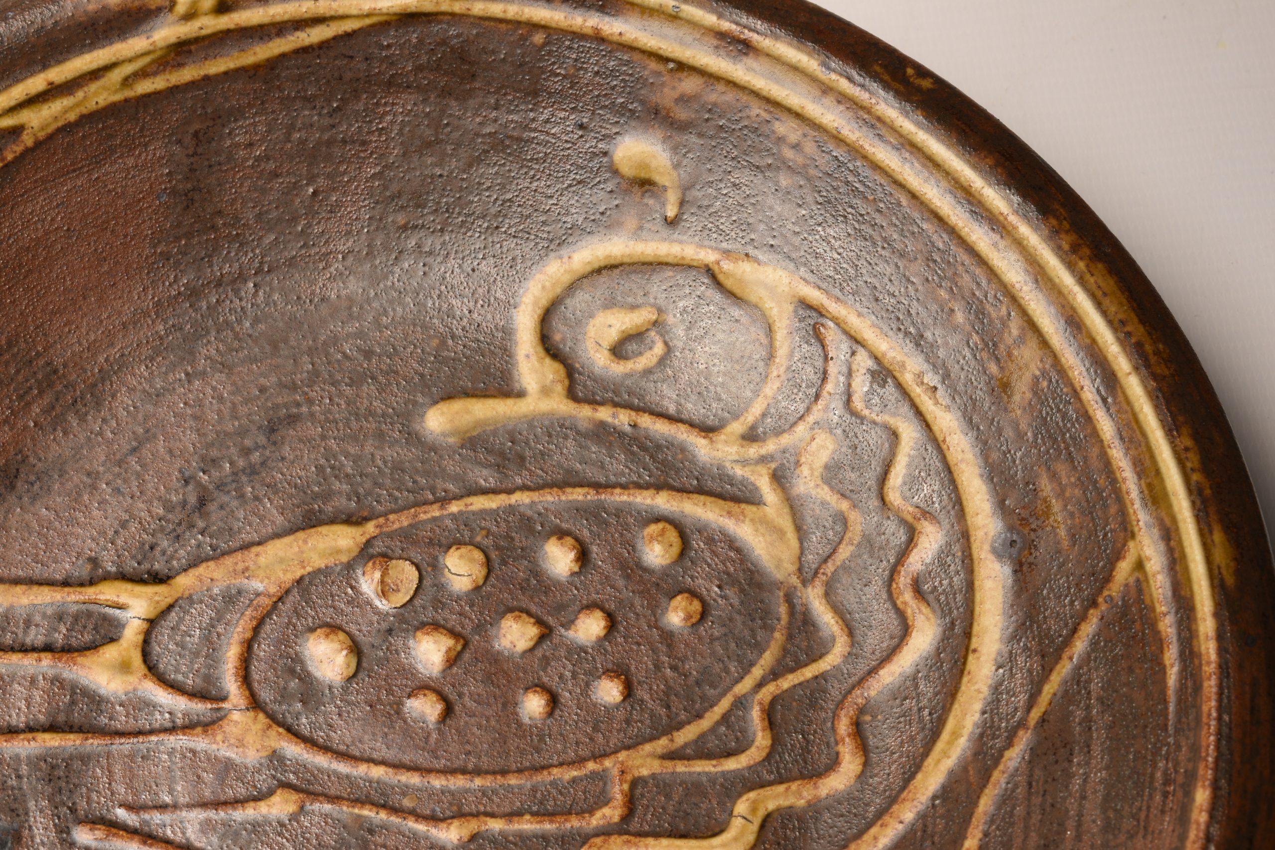
Svend Bayer Bird Plate
Svend Bayer work is highly regarded being a pupil of Micheal Cardew and having worked at Wenford Bridge and Brannam Pottery. Using the traditional time consuming wood fired technique he typically does not sign his work. The video below is the best introduction to his work.
Brid plate. 250mm (10 inches) width.
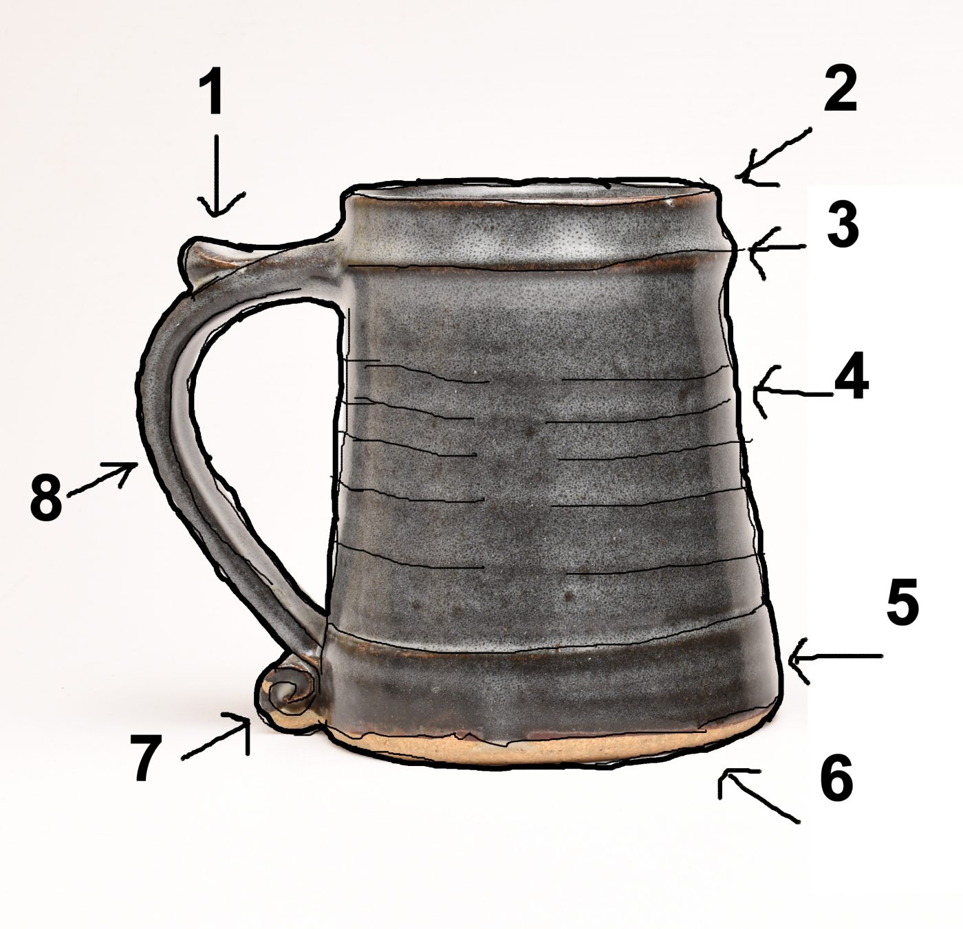
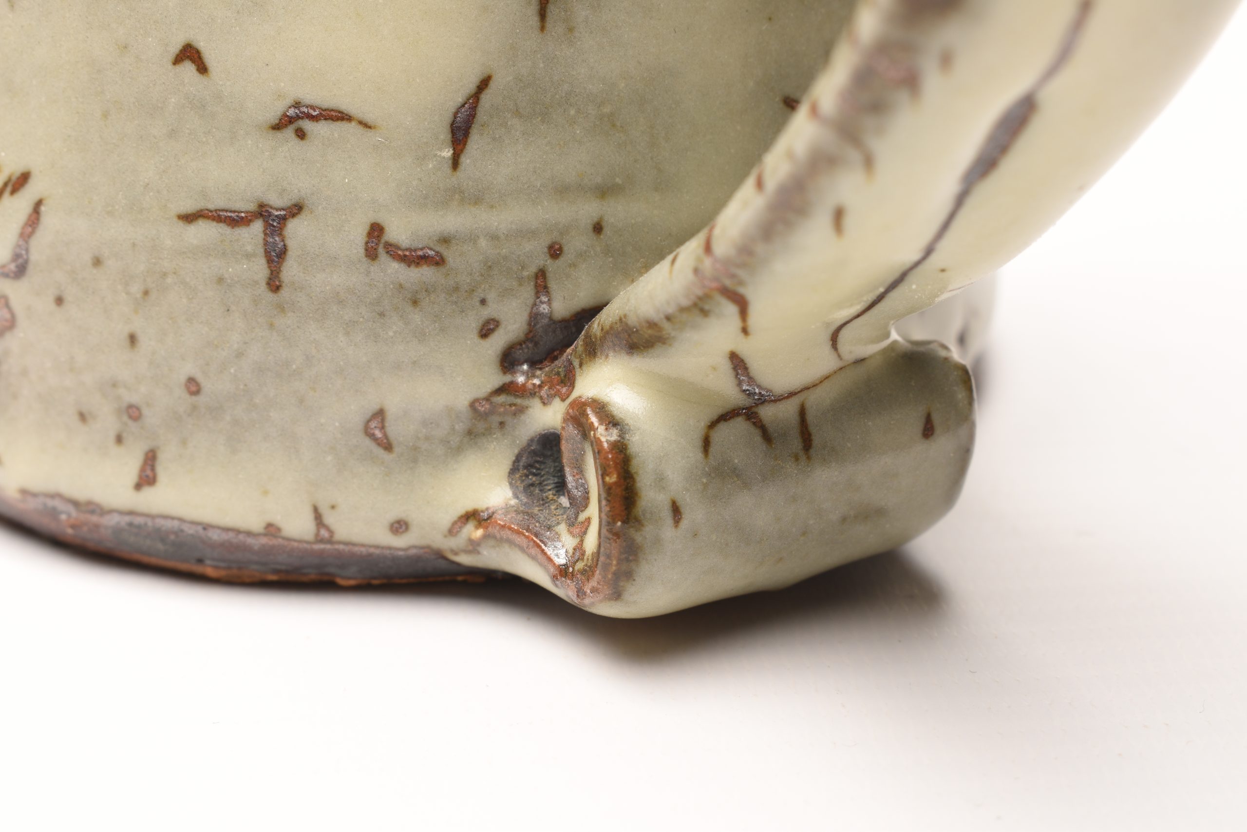
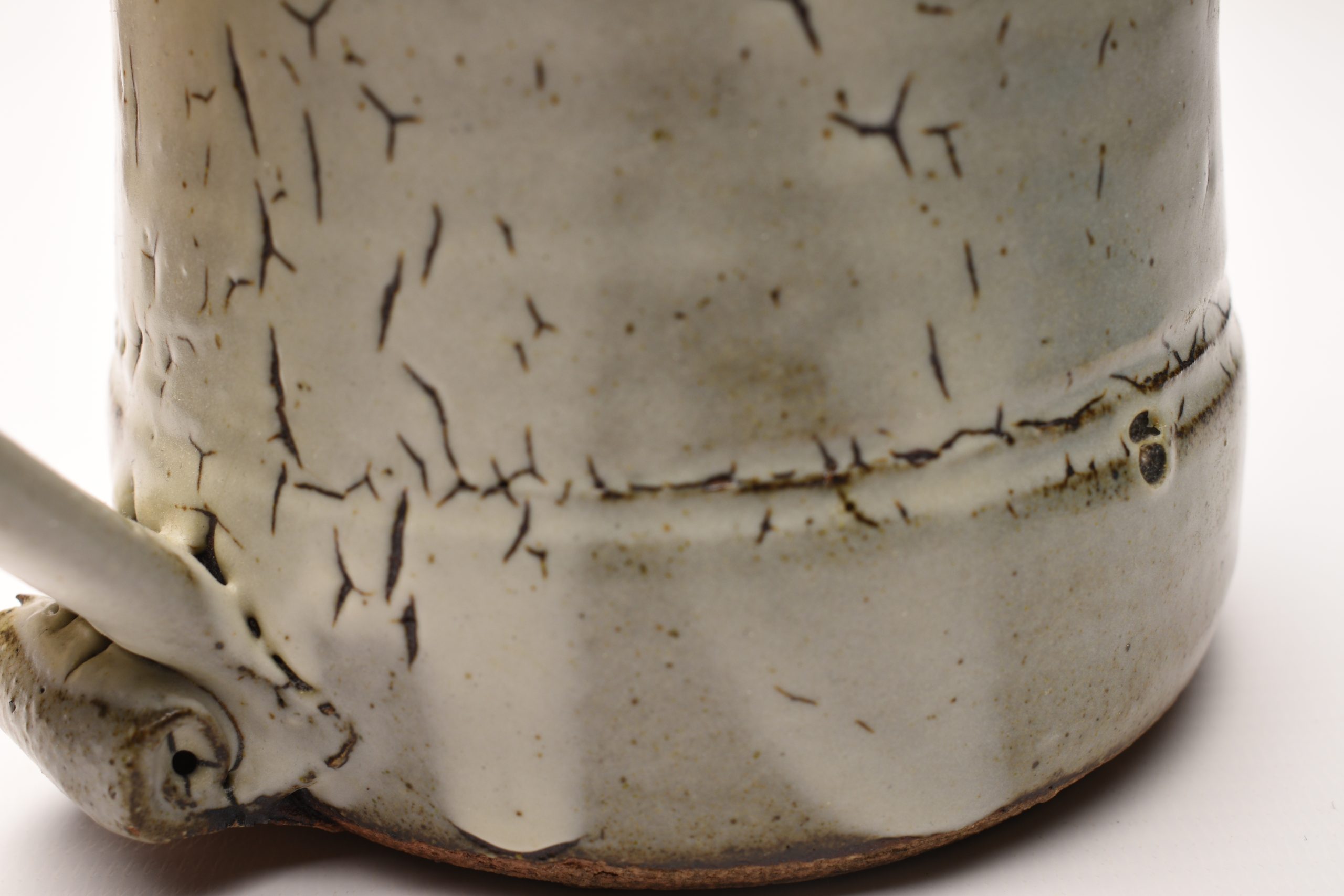
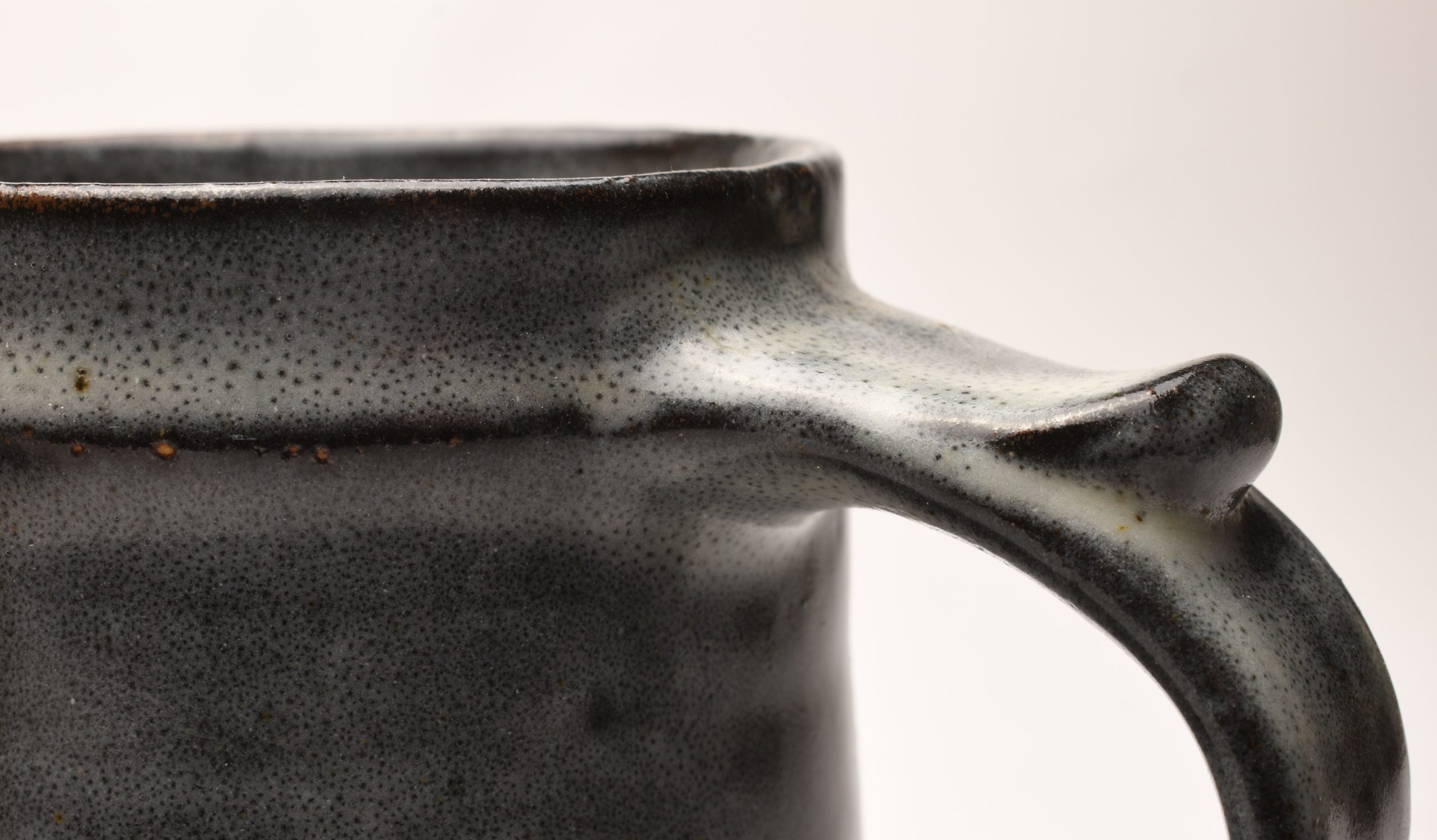
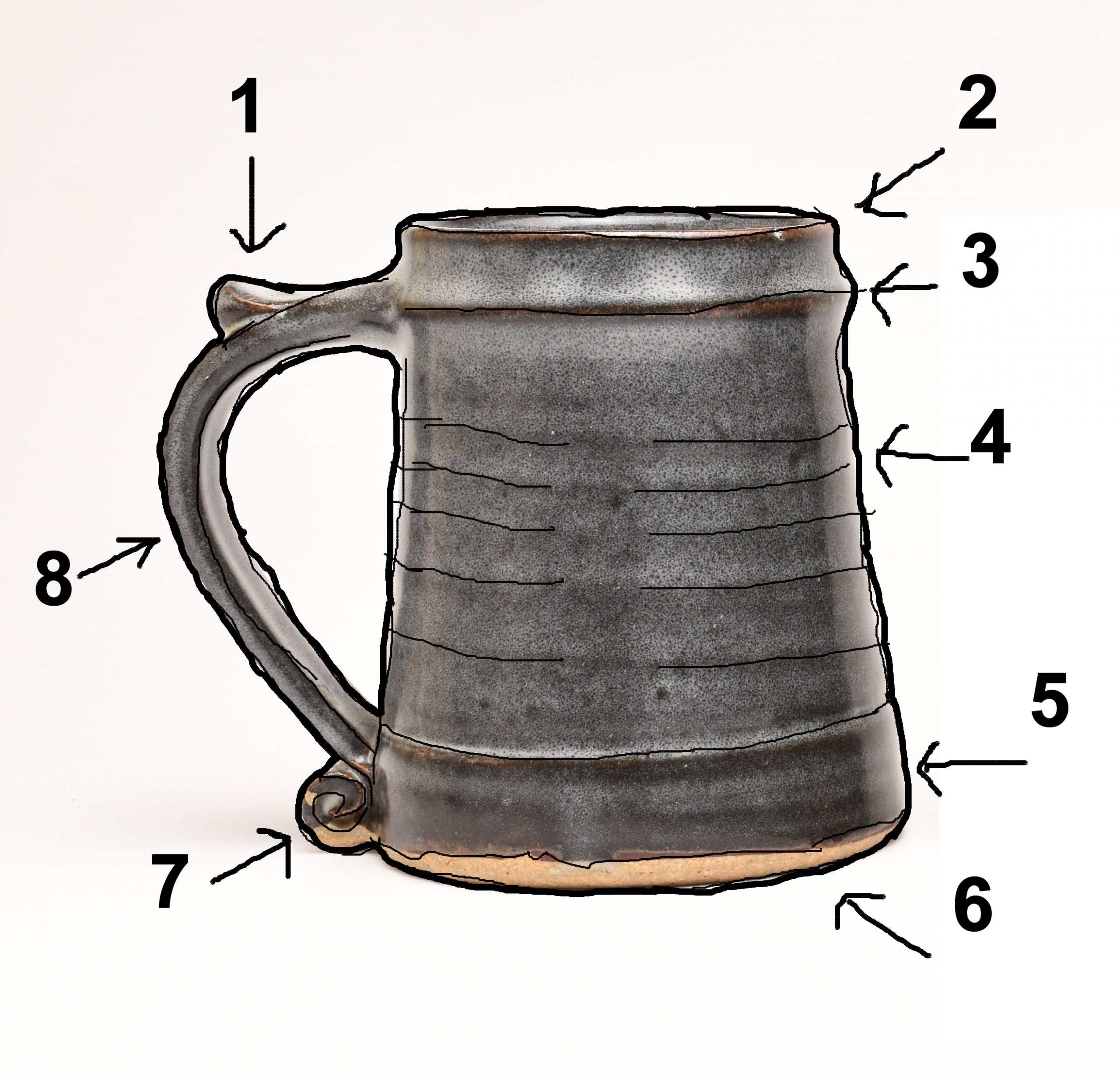
St Ives Leach Pottery Standardware Pint Tankard Design Analysis
A humble pint mug but I thought it worth explaining why I think the Leach Pottery St Ives Standardware Pint Tankard is such a great design. The shape is a classic for me. As with all really good design there is a rightness about the form, often if something looks right then there is an underlying reason it's not just an applied aesthetic or decoration. The modernists of the 1930s explained it as 'form follows function' but there is something more, often ease of construction or construction requirements also manifest themselves.
A good example in architecture is why on a roof, slate tiles are often much bigger at the base of the roof than at the top. It is possible to go through sound reasons for this; it's harder to carry the big slates to the top, the bottom edge of tiles will have ladders propped against it and needs to be stronger, inherently weight at the base is more stable than weight at the top, there is more water passing over the bottom slates than the top ones.
There is good function behind all design.
.
Pint Standardware Tankard Design Elements:
1) Thumb Rest - Makes the mug so much easier to hold and more comfortable. The bigger and heavier the vessel the more essential this becomes.
2) Thin Rim - Ever wondered why you like some cups and not others. Often its to do with the thickness of the rim. To take a small sip requires a thin edge - a wine glass for example. Thick edges are clumsy and only good for quaffing. It's very difficult to sip from mugs with thick edges. The tapered top edge here is there for a reason on the St Ives Tankard.
3) Rim for Bottom lip - Again a really essential tool used to tell you when the mug is in the right place in relation to your mouth. The way most people drink is to slide their bottom lip up the mug. This helps position your mouth in relation to the mug.
4) Throwing Ribs - These could have been removed but they chose to include them in the design. They help to grip the mug when not using the handle. When washing it for example. The better you can grip it the less it will be dropped and the longer it will last.
5) Base Shoulder - It's subtle but notice that the base steps out about 25mm above the bottom. This helps thicken the bottom of the whole mug. The base will take most of the impact every time it's put down so this really helps strengthen the mug.
6) Tapering Shape - A tapering shape with a wider base helps in two ways. It makes the mug more stable and less likely to fall over and it means there is again more material at the base meaning it's a lot stronger there = less damage. Mugs that taper the other way - towards the top look very strange indeed.
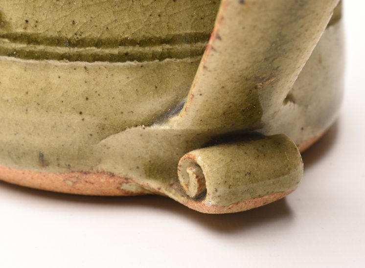
7) Scroll - This at first glace looks like decoration. Nope, it's there to strengthen and protect the joint of where the handle joins the main body, a natural weak point and point of failure.
8) Tapering Handle - Meaning the top is wider than the base (pulled?). The top needs a better joint than the base as it will take a significant amount more stress than the base. You could have a handle that is only attached at the top, but you can't have one that is only attached at the bottom. SI
It is probably worth noting that failure in design is often fatal. The example typically used is the wheelback chair with a back, four legs and three stretchers bracing the legs. Failure of any one of the mortise & tenon joints will eventually lead to disaster. Often sooner than later. The chair needs all it's elements to function perfectly otherwise stresses will transfer from one joint to another. There is no redundancy in design, there is no space, time money, or effort for redundancy, efficiency is the order of the day.
It's the same with the Leach Tankard, I don't see how it can be improved. It's perfect.
It also holds a whole pint of my favorite British ale which is always a good thing.
Micheal Cardew Youtube
Micheal Cardew video on Youtube. Thanks to the original poster monkeybss.
Ray Finch Youtube
Ray Finch video on Youtube. Many thanks to the original poster The Gloucestershire Guild of Craftsmen
Svend Bayer Youtube
Svend Bayer video on Youtube. Many thanks to the original poster Goldmark Gallery
